Something mundane and innocuous happened today. This morning I noticed my wife was throwing away something that we as a family have outgrown. And yet, the implications of its removal impacted me far beyond the item itself, and I’ve spent a good part of the day thinking about what it means and what it says about seasons in our lives.
So what was the item…a humble Diaper Genie…that’s right, a special trashcan for disposing of baby diapers. So why would this item cause such philosophical reflection? Its a pretty great product, custom built for the challenges of diapers, but that is what it is specifically for, nothing else. And as of this morning, we no longer need one in the house. This is ultimately a good thing, as it means the twins have reliably moved beyond the need for diapers and us parents beyond the travails of potty training. But it also means our babies have grown past a stage of life, and as parents, we won’t see that stage again.
This one was actually the second edition of this product we’ve owned, the first having been given to us by a member of the #oMC and fellow parent at our first child’s baby shower over seven years ago. Seven years. For seven years this product has been a requirement in our family life – a thing that I attended to on an almost daily basis – and after today, I doubt I’ll ever own one again. And while a significant part of my heart aches at the idea that this season of having babies in our lives is changing, I’m simultaneously inspired about what it means for the future.
As any parent will tell you, raising kids is hard work, and ours have been no exception…and twins, woohoo, its a ride. During this time my wife and I have also been building careers, hers a steady crescendo, mine with a bit more peaks and valleys. For me at least there has been a recognition that regardless of what I thought I could undertake, or effort I thought I could commit to a project, the reality was that it would ultimately be metered by the time and energy required to be the parent I want to be. With today’s marker in time, its clear that this phase of intense commitment will soon be getting easier. Its true, when children turn 5, they become much more self reliant and the overall task of parenting lessens a bit.
Am I complaining? Absolutely not…this period of life has been magical, and even with all the challenges of the pandemic these last almost two years, we’ve had our children home and part of our daily existence in a way that office / day care life never allowed. And while it feels a bit like the leaves are turning yellow on this season of parenting, it simultaneously feels like green shoots are starting to emerge on the next season of work. I’m lucky that my passion is my vocation, even when it is hard, it is fun. And there is so much that I want to do…which hasn’t changed in the last seven years…its just now I can feel that there will be more energy that can go into it. I try not to look past any single day when it comes to the family, and I won’t rush this now, but its clear the days are starting to get longer.
Today I was lucky enough to present at the State of the Map US conference in Detroit, Michigan. The topic is near to my heart, the education initiatives of the American Geographical Society, specifically, the growing relationship between AGS Geography Teacher Fellows and the OpenStreetMap community. The slides are posted below, and the talk was filmed so expect the video will be here. Ultimately we asking for help from the OSM community to help AP Human Geograpy teachers with technical support around mapathons. If interested, sign up here: bit.ly/AGSmapathons
Support Geographic Education with OpenStreetMap and the American Geographical Society
A core tenet of the American Geographical Society (AGS) is expanding geographic education. To that end the AGS, and its corporate partners, have established the Geography Teacher Fellows program, and over the last three years have directly engaged with 150 Advanced Placement (AP) Human Geography teachers across the United States. A key piece of the Geography Teacher Fellows engagement is the introduction of OSM mapping and mapathons to the human geography curriculum. The response to this TeachOSM-led training has been overwhelmingly positive, but teachers have been limited in their adoption of OSM mapping by the technical hurdles of conducting a mapathon. To address this gap, AGS is looking for volunteers from the OSM community that would like to be paired up with AP Human Geography teachers in their area. The idea is that a local mapper would work directly with a local AP Human Geography teacher to put on a mapathon, to provide onsite tutorials, or to simply be available to answer questions of students and teachers in their locality. For more information, see the AGS website (https://americangeo.org/initiatives/ags-geography-teacher-fellows/) or sign up directly online (http://bit.ly/AGSmapathons)
A recent article on the most remote places in America struck a cord with me. The article, published by the Washington Post, utilizes recent work on global travel times that models the transportation networks between any two places on earth, using a range of transportation options. This work, A global map of travel time to cities to assess inequalities in accessibility in 2015, is a tremendous achievement of spatial data aggregation, topological connectivity, and spatial modeling, and is worthy of a post in and of itself.
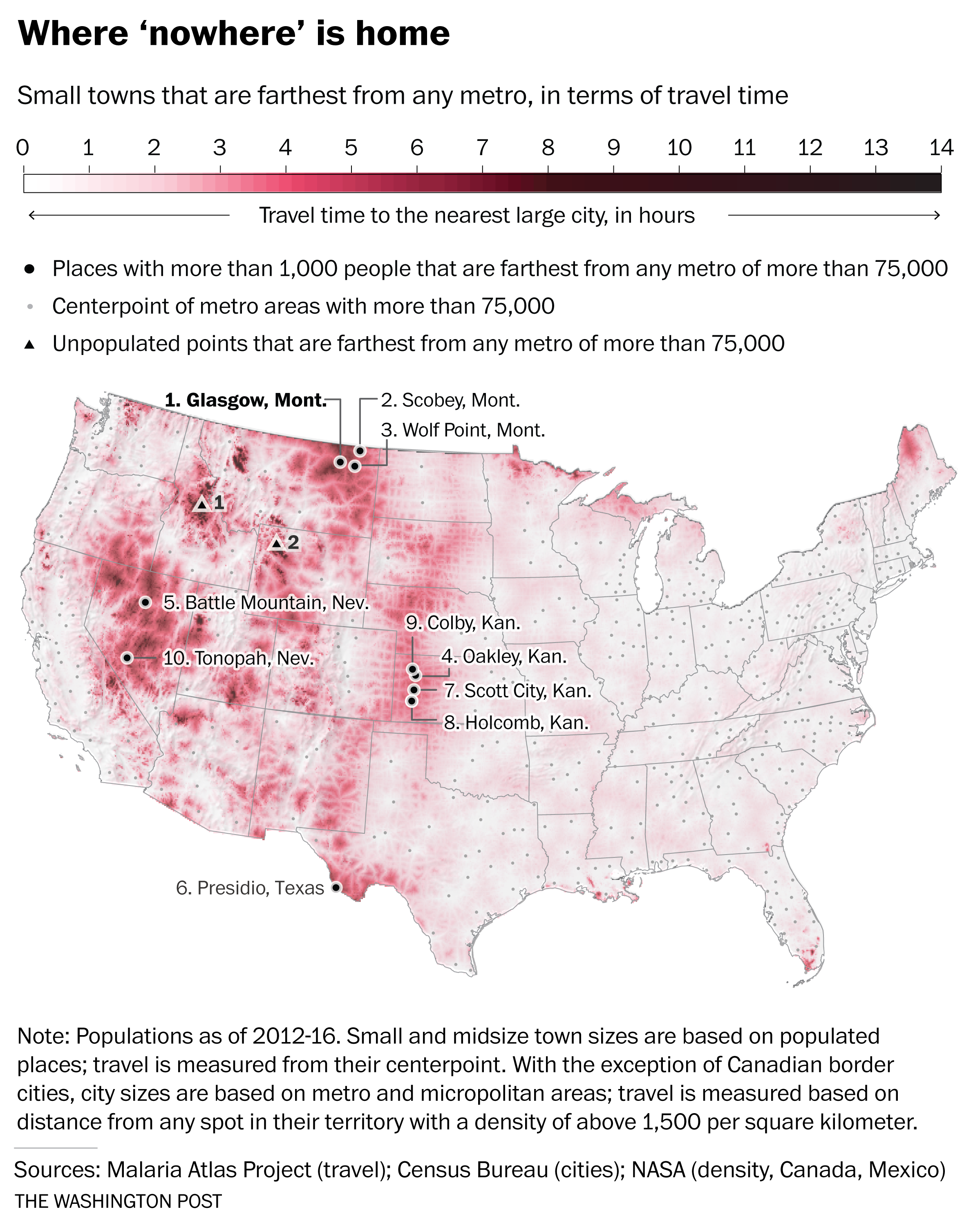
That said, it was the work done by the Post , using the Global travel time data to determine remote places in the United States that caught my attention. In looking at the map (Figure 1 below), it takes a second to understand what is being modeled. The details are spelled out quite clearly in the article, but of course, I looked through the map first.
Figure 1: Map of travel times in the United States, originally from Washington Post article published February 20, 2018
When you think of “remote”-ness, the first thing the comes to mind is a desolate mountain cabin or desert camp. And the map above does highlight the two places with the longest travel times in the Lower 48. However, this is an absolute value of remoteness, a one way path. The more interesting component of this analysis is the comparative definition of remote…where the travel time between two actual locations is calculated. The desolate mountain cabin is the domain of a single person…what does it mean to be remote when you live in an actual town?
In this analysis, the travel time between every location in the Lower 48 U.S. and the nearest metropolitan area (city with a population greater than 75,000) is derived from the Global travel data. This creates a continuous surface where every 1,000m x 1,000m grid cell contains a travel time. When mapped, this data forms a type of “travel-shed” map that is reminiscent of hydrologic and watershed maps. Commensurately, the boundaries of the travelsheds are the areas with the largest travel times, and help delineate regional zones where a particular city is dominant. The travel speed of various transport modes are also reflected in the data, e.g., interstates are faster than secondary highways, and that fact imprints a pattern where the fastest paths resemble river valleys in the travelsheds. Finally, the ridges between travelsheds provides the “remote” areas, farthest away from population centers.
From a macro perspective, the highly populated eastern U.S. shows much lower variation in travel times when compared with the more sparsely populated areas of the Great Plains, Rocky Mountains, and intermontane areas of the western states. This is a combination of higher overall population and a fairly even distribution of populated places…essentially there are so many people that it’s hard to get too far from a larger town. Notable areas of high travel times include the intermontane areas of Utah and Nevada, the Trans-Pecos region of West Texas, and an interesting ridge through the mid continent that roughly follows the western extent of the High Plains physiographic region.
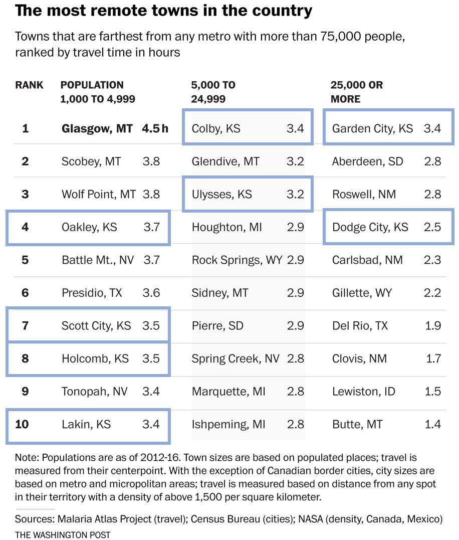
In the next step of the analysis, the travel time layer is intersected with the location of all American cities greater than 1,000 people, and the travel time between the small city and the nearest city of 75,000 people was calculated. Brilliant. In fact, they did the same analysis comparing towns with population larger than 1,000, 5,000, and 25,000. The ranked list of cities is displayed in Figure 2 below.
Figure 2: Ordered list of most remote towns in the Lower 48 U.S., with the Kansas High Plains towns highlighted (added for this blog post). Originally published in the Washington Post article published February 20, 2018
So why is this significant to me? Beyond being a super slick GIS application, two other reasons. First, I grew up in southwest Kansas, an area that I have often described to people as being about as far away from anything as you can get in this country…and it turns out, I was right. My hometown is #10 on the list…and four other locations in the top 10 of the small towns list are its neighbors. Additionally, other towns in southwest Kansas top the most remote in the mid- and large- town lists. The longitudinal ridge of “remoteness” that extends along the 107 degree west longitude line seems to be a “travel-shed” boundary between the populated places of the Colorado Front Range and those in eastern Kansas.
The second interesting element of this analysis is how it compares to my previous work on “flatness”. I haven’t done any quantitative work on this, but a visual comparison of the two maps seems to show a bimodal distribution of remote places…they are either very flat or very not flat. Conjecture could lead one to intuit that flat places are remote because they may be uninteresting to live, while not flat place are remote because it is difficult to get to them.
But I think that is simplistic, the flat remote places are instead driven by the economic geography of the region. For southwest Kansas, that means an economy dominated by agriculture…a lifeway that increasingly requires less and less people, but that still demands population centers at regular intervals to efficiently collect and transport the harvests. This leads to the mix of low population, that is regularly dispersed, and occupies flat terrain. Compare this to the remote area of central Nebraska, which is also on the 107 degree meridian, but that doesn’t appear in this list because there are no settlements that exceed 1,000 people. The Sand Hills mean there is no agriculture, no economic lifeway that requires any substantial grouping of people.
In conclusion, this list of towns reads like a schedule of summer swim meets from my youth…and it’s just bizarre to see it spelled out in a national newspaper. These places that I know well, that I spent significant parts of my life studying the archaeological and climatic past of…are in fact, some of the most remote, yet connected, places in the United States. And now having spent almost 10 years in DC, I’ve come to appreciate just how far the cultural distance is between these remote outposts and the populated centers of the coastal U.S.
The human geographies that occupy these urban / rural divides is tremendous, and there is no clear path between them. Communication technology has shrunk these distances, whether it be the satellite dishes that were prevalent in my youth, or the internet now, technology has homogenized the cultural experience to a large degree…overcoming the limitations of spatial distance. But these areas do feel “remote”, they are a long way, both in culture and travel distance, from the economic and cultural engines of our society.
It is interesting that the original goal of the global travel time data was to assess the inequalities that become manifest when the accessibility to cities is limited. The value of this data for the Sustainable Development Goals (SDG) is clear, and I think will be used in a myriad of ways to plan and contextualize international development efforts. But what does it mean for our society, what does being remote inside the United States mean? What inequalities will become manifest for our own citizens as accessibility to cities remains limited? Maybe this map should be used for some domestic sustainable development?
And while it was the personal connection to my life that drew me to this work, it is clear the data and methodology presented here do offer an valuable framework for understanding the implications of population distribution. In the SDG context, the use of these spatial tools will positively impact development planning and execution, and the team who compiled this data should be applauded. The geospatial revolution continues…
Weiss, D. J., Nelson, A., Gibson, H. S., Temperley, W., Peedell, S., Lieber, A., Hancher, M., Poyart, E., Belchior, S., Fullman, N., Mappin, B., Dalrymple, U., Rozier, J., Lucas, T. C. D., Howes, R. E., Tusting, L. S., Kang, S. Y., Cameron, E., Bisanzio, D., … Gething, P. W. (2018). A global map of travel time to cities to assess inequalities in accessibility in 2015. Nature, 553(7688), 333–336. https://doi.org/10.1038/nature25181Cite
Every November the American Geographical Society holds its flagship Fall event, the Geography 2050 symposium. Designed to be a multi-year strategic dialog on the trends that will affect the planet in 2050, the theme for 2017 was the Geography 2050: The Future of Mobility.
In the Geography 2050 sequence, we envisioned the world of 2050, then focused on the inter-related topics of urban growth, sustainability, mobility, and next year will be energy. For each event we assemble a highly curated set of sessions and speakers that combine a geographic perspective with the academic, government, and business communities in a way that no other event replicates.
Background
In order to understand the roots of Geography 2050, and what we are trying to accomplish as the American Geographical Society (AGS), some backstory is needed. Starting four years ago, the AGS began a dramatic revitalization effort, one that would bring a significant influx of new energy, people, and ideas into the Society. Spearheaded by the now AGS Chairman, Dr. Chris Tucker, the idea of AGS 2.0 has taken root…with Geography 2050 one of its central concepts. This video, from the initial Geography 2050, describes the 2050 concept in more detail:
This synthesis is the hallmark of the AGS, and a differentiating factor in the discussions we facilitate. AGS history represents some of the best applications of the geographic perspective over the last 165 years, whether that be exploration, commerce, diplomacy, defense, or education. As we envision the role of AGS in the 21st century, we see a United States in need of greater geographic awareness. We see one role of AGS as a means to help foster a national dialogue on spatial literacy, and be a force for change in geographic education. These values are summed up well by AGS President Emeritus (and my Ph.D. advisor), Dr. Jerome Dobson, in this short video from the original Geography2050:
Highlights
The Future of Mobility event continued this trend, and the quality of sessions may have even exceeded previous years (kudos to the Dean Wise, AGS Councilor and the conference chair). It was hard not to leave the conference amazed at the pace of change in the mobility sector, and how close this next wave of technologies is to fundamentally changing how we are spatially organized. Videos for the sessions are being finalized now, and I’ll update when they are complete (see the Program here). Below are a few of my takeaways from the conference (and since I’m not an expert in mobility and transportation, I learned a tremendous amount from the sessions).
Clearly electric vehicles are already here, but when combined with longer battery life, increasing levels of automation, and “transport as a service” business models, the economics of automobile ownership and utilization change dramatically. The impact of this change on individual behavior and public planning for infrastructure leads to some widely divergent models that swing between transport utopia and massively underfunded public transportation. And this does not account for the potential of automated trucking and freight transport. We are already on the cusp of these changes, and even some of the best minds in transportation planning don’t really know what is going to happen in the next 10 years…let alone the 33 years till 2050.
Vertical take-off and landing (VTOL), flying cars, and other personal “jet pack” devices are becoming a reality. At this point, each of these are still piloted by humans, but clearly have the potential to become more and more autonomous (or remotely piloted). The already stressed regulatory environment for simply figuring out how to handle “beyond line of sight” human-flown drones, is going to be incredibly burdened as autonomous package delivery, flying taxi service, and personal VTOL devices become more common. The domestic and international airspace management regulations are incredibly complex, and accommodating these new forms of transport will be a generational challenge.
Hyperloop…wow…paradigm shift in the making. The potential of this technology is so absolutely incredible, it is truly difficult to appreciate the implications on human society. If we have any political will to accomplish great things left in this country, we should move as fast as possible towards Hyperloop. America’s bet on the automobile has been an incredible benefit to our society, and yet it has also locked us into a transport paradigm that is strangling our cities. From everything I saw, Hyperloop is the only technology that could fundamentally change the equation. The sheer speed that it travels will make disparate cities the same travel time away as current metro stops. To view some of the proposed Hyperloop routes and travel times between stops, check out the winners of the Global Route Challenge…with interactive maps.
Honoring Digital Cartography
On a personal level, this year was the first time that I’ve participated in Geography 2050 as an AGS Councilor (I spoke at the first event in 2014 before I joined the AGS Council). Having known and studied under Dr. Dobson since his arrival at the University of Kansas in 2001, I have been long steeped in AGS and its proud traditions. When Chris first proposed AGS 2.0, and started to invite new Councilors, I knew I wanted to be part of bringing new energy into the Society.
What I bring to AGS is an expertise in geographic information science and technology. Building on that background, my goal as a Councilor is to ensure AGS continues to be at the fore of geographic technology, and that the Society begin to formally recognize the contributions of those who are responsible for powering the “geospatial revolution”. Over the last 20 years geographic technologies have revolutionized our society (Global Positioning Systems, high resolution satellite imagery, in-car navigation, interactive web maps, etc…), and it is important that the Society formally acknowledge those in government, industry, and academia who contributed.
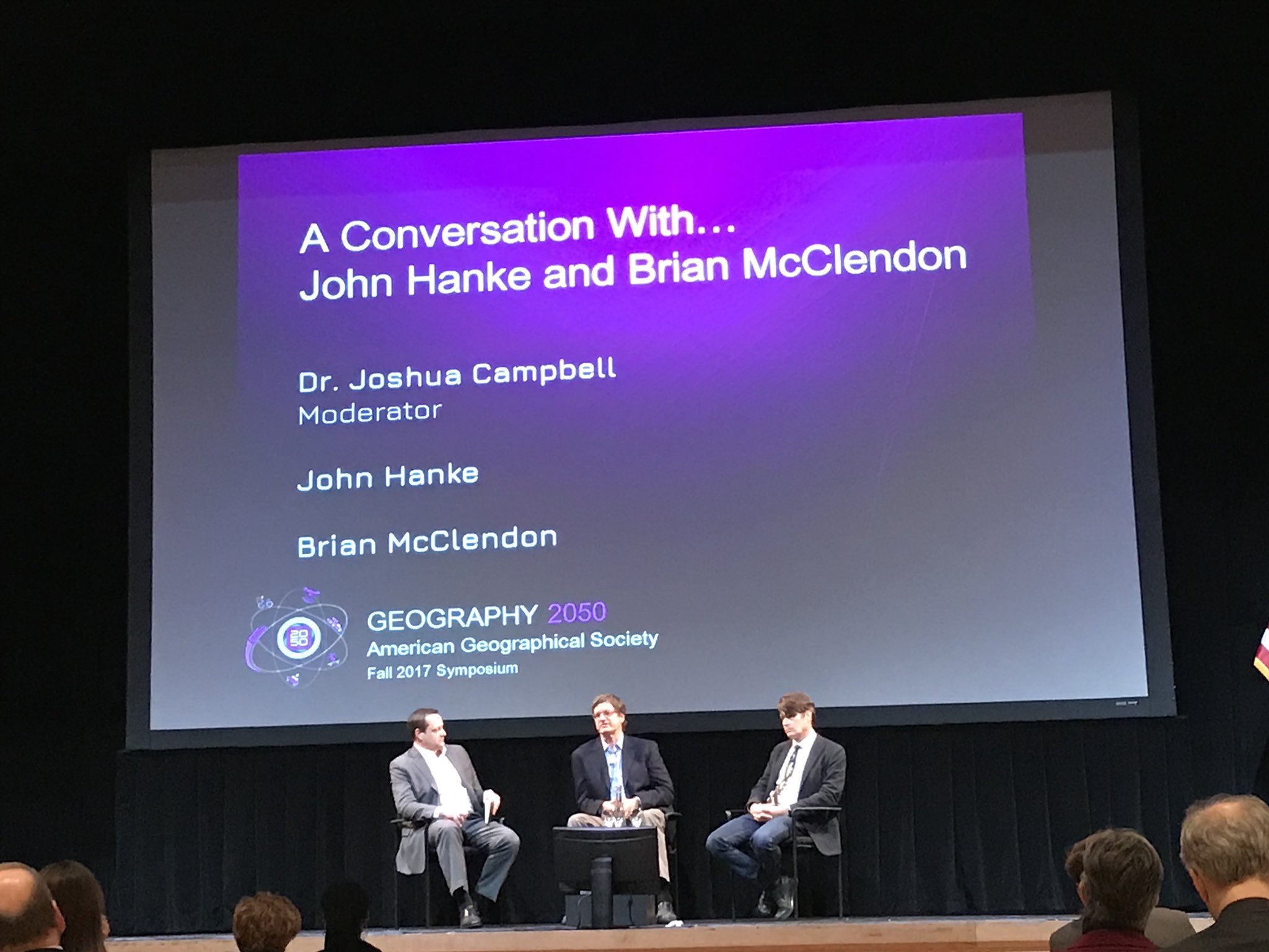
To that end, the 2017 edition of Geography 2050 marked the first attempt to do this. I believe there are many people who deserve to be honored for their contributions to the post-millennium explosion in digital geography, so nominating the right people had to be a mix of contributions and applicability to this year’s 2050 theme of mobility. Given that combination, it was clear that Brian McClendon and John Hanke were the right choices to nominate for the AGS O.M. Miller Cartographic Medal. I made the nomination, and the AGS Vice President and Chair of the Awards committee, Deborah Popper, wrote up two wonderful award letters that were read at the ceremony.
A Conversation with John Hanke and Brian McClendon
In addition to the award, both Brian and John were kind enough to participate in a Geography 2050 session, which was formatted as a conversation with them. It was an honor to moderate this session, a job that required I ask a couple opening questions and then get out of their way. I don’t get anxious speaking in front of crowds often, but have to admit, this one was a bit nerve-racking. But ultimately I think the session went well, and there was a lot of great feedback.
Update: Video of the session has been posted here and embedded below:
The goal of my questions was to first look back on their Keyhole / Google Earth experience, using it as a historical lens to view current trends. Then to discuss trends in autonomy and augmented reality that are affecting mobility. Co.Design (a Fast Company subsidiary) wrote an article on the session that has more detail.
I’d like to thank both of them personally for taking the time out of their schedules to come to New York to accept the AGS Miller Medal and participate in the panel. I certainly learned a lot, and feel that as AGS, we are off to a good start in honoring the pioneers of the modern digital geography movement.
If interested in additional information, Trajectory Magazine recently published an article on the history of Google Earth that provides great background on the evolution of the technology, and its role in the national security context.
Earlier this summer, I was asked by a colleague at the Graduate School of my alma mater, the University of Kansas, to contribute content for their Grad Paths newsletter. The goal was to describe my work, post-degree, and provide advice to current grad students. It was an interesting exercise to concisely describe my work to a non-geography audience, and in a context of what I think is important for current graduate students who want to pursue work outside the academy after graduation. Below are the questions and my responses.
What do you do? (Usually we ask that this relates in some way back to how they use their graduate school knowledge and/or training in their current position if possible.)
I am an applied geographer that specializes in geographic information science and technology. Through Sand Hill Geographic, I provide consulting and technical services to organizations that are trying to better utilize the geographic dimensions of their information. Being in Washington DC, I try to work at the intersection of the national security, diplomatic, and development communities.
In the last eight years I’ve been a Geographer at the U.S. Department of State, an executive at a geospatial software startup, and now run my own consulting business. I’ve worked on projects related to several U.S. Government agencies including the Department of State, Department of Defense, U.S. Agency for International Development (USAID), as well as the World Bank.
Each of these organizations need to answer questions that are critical to their operations, and geography (technical, physical, and human) can play a large role. Below are few examples from each institution:
• For the State Department, understanding how conflict or natural disasters will impact vulnerable countries is a key concern. What are the dynamics of refugee movements (who are they, where are they coming from, where are they going), and what social, economic, and policy impact will it have regionally and globally? Numerous examples of this work can be found at the Humanitarian Information Unit (HIU) website, https://hiu.state.gov
• For USAID, what is the spatial extent of a drought and how do we preposition relief supplies to deliver aid? Where are all the buildings in an area with an on-going malaria eradication program, and how can we plan to spray all the buildings?
• From a national security perspective, how can we discover, monitor, and predict threats? This can range from mapping the movements of foreign militaries to the spread of Ebola. The ability to anticipate threats gives policy makers a decision advantage. Geographic technology, spatial analysis, and increasingly human geography, are valuable tools for our national security analysts.
• For the World Bank, the goal is to make financial investments that will reduce poverty and increase equality. In order to prioritize investments, fundamental questions about a country’s exposure to natural disasters, and their related disaster risk management plans, are required. Mapping risk and measuring the impacts of financial investments on that risk are key metrics for evaluating a program’s effectiveness.
In all these cases, I help build workflows that focus on the geographic elements that provide insight to these questions, and construct technical systems to collect, analyze, visualize, and share data and analysis products. Often the technical solutions are very similar, but their implementation into various bureaucratic institutions is very different.
The need for quality geographic data to use in these systems is a common requirement, and is often lacking. To address this problem, I helped create MapGive, a crowdsource mapping initiative at the State Department designed to catalyze open geographic data production to support the humanitarian, development, and disaster risk reduction communities. This project has supported open mapping efforts all over the world, and has played a significant role in many large natural disasters and humanitarian emergencies.
My graduate school experience provided the academic training and applied research in Geography, Geographic Information Systems (GIS), and Remote Sensing, that form the core of what I do today. I came to DC well equipped to do the work.
What is your favorite aspect of your job/career?
My favorite part of this work is simply the huge array of issues that can benefit from the application of geographic knowledge and technology. The explosion in geographic technology means we have an ever-expanding array of tools to collect, analyze, visualize, and share data and analysis. These are essentially new vectors for doing what geographers have always done…derive new insights by utilizing a spatial perspective. The work is never boring.
What advice do you have for current graduate students?
Enjoy the process.
Graduate school is grueling, and often takes a toll on students. Focus on the goal of completing the thesis or dissertation, and work to integrate writing into your life systematically. Realize that getting the PhD is actually the start of your career.
Make your work relevant.
If you want to be a practitioner in your field, spend time outside the academy. Take the internship with an agency or company. It is critical to get real world experience. Often you’ll find you have more than enough academic knowledge to do the job, but you lack the social network, understanding of bureaucracies, or funding mechanisms that are required to turn that knowledge into policies or projects. This experience will not only make you more effective, it can provide a unique kind of confidence when you return to school, that you can and should finish the degree.
This year’s Free and Open Source for Geospatial (FOSS4G) North America event was held in Raleigh, NC between May 2-5, 2016. Attendance increased by 150+ over last year, bringing the total to over 550 registrations. While typically a developer conference with technical software presentations, recent years has seen an increase in participation (both attendance and presentations) from the user community. This year continued that trend, and the agenda included a wide array of topics. In addition to good facilities and well run logistics, the program committee did an excellent job curating the presentations; nearly all of the sessions I attended were appropriate content and well delivered, a feat for any conference. A full list of the attended sessions I attended is in the table at the end of the post.
Below are some of my takeaways from the conference, categorized into three general themes: Tools, Data, and Visualization.
Tools
It is clear that open source software continues to mature, and when combined with new deployment technologies like Docker containers and cloud, it is a fundamentally different world than a few years ago. This is clearly not a ground shaking statement, but the speed by which anyone can go from zero to a cloud-deployed, scalable geographic computing infrastructure is amazing.
Machine Learning is everywhere. Granted I haven’t used ML approaches in a few years, but my concern is that simpler approaches of statistical modeling are being overlooked just to use the big, new shiny thing. The underlying assumption with ML is that all problems are solved best through inductive methods, which potentially discounts the wisdom of domain expertise. ML is obviously very powerful when lots of data is available and should be part of the modelling toolkit, but it’s not a magic bullet and mis-applications are going to become more common. Using TensorFlow or the other new algorithms doesn’t fundamentally change the need to understand how statistics and modeling works, and modelers need to be aware of the full range of statistical tools.
On the Natural Language Processing (NLP) and geocoding side, GeoParser could be key bridge between the document open data and geospatial open data communities. Combining tools like Apache Tika, Stanford NLP, and Gazetteer lookup means there is a single toolkit with the potential to geocode any document. Clearly geocoding results here are limited in success to the quality of the gazetteer, but the processing pipeline is interesting.
The Geo Big Data processing tools continue to mature and are even starting to converge on the use of underlying libraries and database. This collection of tools includes GeoWave, GeoTrellis, GeoMesa, GeoJinni. Personally I’m interested in the use of GeoTrellis for high-performance raster modeling.
Sensors are expanding everywhere: agriculture best example of persistent, integrated data collection across sensors (imagery, lidar, IoT) and application into “smart” devices (self-driving farm equipment and custom planting / harvesting strategies). OpenSensorHub can be used to integrate various feeds, thinking of applications with automated hydromet, weather, and seismic stations, as well as other crowd reported data feeds.
Data
Vector tiles expand market share: nascent analytical capability, new version 2.0 specification, true 3D in the tile (when comes 4D), added to GeoServer
Remote Sensing is big: Cubesats, Drones, Imagery, Point Clouds all continue to grow and expand into all market verticals (farming, logistics, business analysis leading the way)
Remote Sensing is still hard: massive imagery catalogs only further expose fundamental remote sensing issues on analysis (orthorectification and image-to-image registration, atmospheric effects on spectral reflectance); drones and kites driving new photogrammetric toolkits; the cool kids are yet to fully catch on to these challenges.
OSM ecosystem continues to deepen and expand: Portable OpenStreetMap, or POSM, is a nice tool for enabling disconnected editing in austere environments. The upgraded HOT Export Tool is a key part of exporting the initial datasets used for the process. The critical question is how to get data back into OSM. Currently all edits are manually reviewed, using an interesting queuing mechanism that maintains individual changesets, and then uploaded using an import account. The question is how will the method scale when remote mapping is occurring at the same time as field mapping, the potential disconnect between edit histories of the disconnected branch can and will be an issue.
Visualization
Vector tiles is driving more client side rendering. Mapbox obviously leading the way here, but Boundless now supporting vector tiles in GeoServer and OpenLayers.
Seamless 2D/3D visualization: Cesium is everywhere, TerriaJS interesting library to add better visualization on top of spatial data catalogs; USGS/NASA GIBS adding atmospheric data slices into dense imagery catalogs. When do we get 4D tiles and/or tiles with multiple versions of the same dataset?
Imagery is driving client side visualization and nascent imagery exploitation tools in the browser
Convergence of ground based and aerial based views: “painted” 3D models from photogrammetric extraction combined with Mapillary type imagery; farm management using ground and aerial lidar clouds.
Sessions
Each of the links below go to the FOSS4G session page, many of which have links to the slidedecks and in the coming weeks will have the video recording of the presentation.
The Ito World crew is back at it with a new OpenStreetMap visualization, this time for Africa. Results are shown at the continental scale and for selected cities over the last couple years. The final product is stunning, as usual.
Growth in West Africa as part of the Ebola response, and the Nigeria eHealth Import are the most distinctive. Other growth areas include a broad swath of East Africa, and the incredible density of the Map Lesotho project. Most impressive, however, is that the growth is not constrained to these areas; it is distributed across the continent. The missing areas are gradually filling in, it is only a matter of time…
Thanks to a generous last-minute donor, we made the $2,000 goal. Thank you to everyone who helped out, with your donations we are going to be able to diaper 2 children for an entire year. Fantastic stuff, gratitude all around.
Original Post — October 1, 2015
While a departure from the typical content on this blog, I hope you’ll spare a moment to read about a fundraising effort my wife and I put together for a cause that has grown near and dear to our hearts, the difficulty many mothers face diapering their children.
It is stunning that in this country up to 30% of mothers struggle to meet the diaper requirements of their children…30%. This stress is the leading cause of mental health problems in new mothers. And to make it worse, there is a hole in the social safety net. Traditional support programs for low-income mothers and families (WIC and SNAP) do not cover diapers and wipes. Recent stories in The Atlantic and the Baltimore Sun cover the “diaper dilemma” problem in detail. This problem has led to the creation of “diaper banks” around the country, including the DC Diaper Bank near us in Washington, DC.
Hilary and I have been humbled and amazed by having a child. So as our first daughter, Flynn, just turned a year old, we wanted to do something to help out those struggling to diaper their children. Our goal is to diaper 2 kids for a year, which costs about $2,000. This comes out to about $20 per week for 1 kid.
If anyone is interested in helping out, please visitFlynn’s 1st Birthday Diaper Drive page on GoFundMe to learn more about the issue and contribute to the cause. All funds will go to the DC Diaper Bank.
It all started with delicious pancakes and a glorified misconception. In a 2003 article published in the Annals of Improbable Research (AIR), researchers claimed to scientifically prove that “Kansas is Flatter Than a Pancake” . The experiment compared the variation in surface elevation obtained from a laser scan of an IHOP pancake and an elevation transect across the State of Kansas. And while the researchers’ conclusion is technically correct, it is based on two logical fallacies. First, the scale the analysis shrunk the 400 mile-long Kansas elevation transect down to the 18 cm width of the pancake, thereby significantly reducing the variability of the elevation data. Second, pancakes have edges, which creates some significant relief relative to the size of the pancake, approximately 70 miles (!) of elevation if applied to Kansas scale (Lee Allison, Geotimes 2003). Using this approach, there is no place on earth that is not flatter than a pancake.
Now, I can take a joke, and at the time thought the article was clever and funny. And while I still think it was clever, it began to bother me that the erroneous and persistent view that Kansas is flat, and therefore boring, would have negative economic consequences for the state. I grew up on the High Plains of southwestern Kansas, where there are broad stretches of very flat uplands. But even within the High Plains region there are areas with enough relief to certainly not be considered flat as a pancake…and this doesn’t include the other two-thirds of the state.
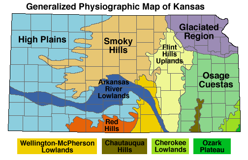
Official Physiographic Regions for the State of Kansas. Note the large number of regions denoted by “hills.”
The joke of it is that the official Physiographic Regions of Kansas Map describes the majority of the state in terms of hills: Flint Hills, Red Hills, Smoky Hills, Chautauqua Hills, Osage Cuestas (Spanish for “hills”). Not to mention the very hilly Glaciated Region of northeastern Kansas, anyone who attended classes on Mount Oread can confirm that for you. And after travelling through other areas of the country, I realized that Kansas isn’t even close to the flattest state.
As luck would have it, a few years after the AIR article I found an opportunity to work on this question of flatness and how to measure it. As part of my PhD coursework I was investigating the utility of open source geospatial software as a replacement for proprietary GIS and needed a topic that could actually test the processing power of the software. Combining my background in geomorphology and soil science with a large terrain modeling exercise using the open source stack offered the perfect opportunity to address the question of flatness. What emerged from that work was published last year (2014) in the Geographical Review as a paper coauthored with Dr. Jerry Dobson entitled “The Flatness of U.S. States” .
The article is posted below, so I won’t rewrite it here, but the central goals were twofold. First, create a measure of flatness that reflected the human perception of flat. This measure needed to be based on how humans perceive flatness, quantitatively based, repeatable, and globally applicable. Second, understand how the general population of the U.S. thinks about flat landscapes, and if there was a bias towards assuming Kansas was the flattest state. This blog post focuses more on the details associated with the first goal, while the article posted below has the description of The American Geographical Society’s Geographic Knowledge and Values Survey that provided data for the second.
Methodology
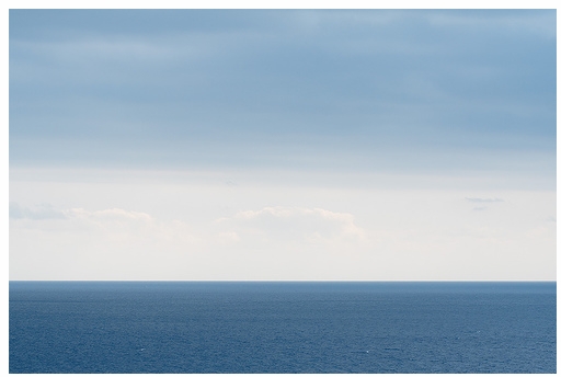
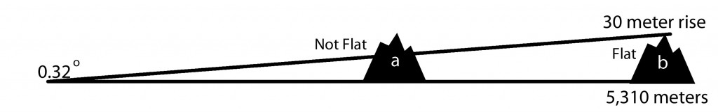
There were many measures of flat that had been developed in the geomorphological literature, but they tended to be localized measures, meant for hydrological and landscape modeling. I wanted something that could capture the sense of expanse that you feel in a very flat place. Beginning with that thought, I tried to imagine a perfect model of flatness. It had to expand in all directions and be vast. The mental model was that of being on a boat in flat seas and looking out at nothing but horizon in all directions. With a little research, I discovered there is an equation for determining how far you can see at sea. It is height dependent, both for the observer and the object of observation, and it calculates that a 6 foot / 1.83 m tall person, looking at nothing on the landscape (object of observation = 0 ft), can see 5,310 meters before the curvature of the earth takes over and obscures view. This was a critical variable to determine, the distance measure for capturing the sense of “flat as a pancake” is 5,310 meters (at a minimum).
A conceptual model of flatness.
With perception model and distance measure in hand, I needed to determine what the appropriate digital elevation model to use. Even though the study area for this paper is the Lower 48 of the United States, a global dataset was needed so that the methodology could be applied globally. The NASA Shuttle Radar Topography Mission (SRTM) data that had been processed by the Consortium of International Agricultural Research Centers (CGIAR) Consortium for Spatial Information (CSI) was the best choice. Specifically 90 meter resolution SRTM Version 4.1 was used, and is available here: http://srtm.csi.cgiar.org/.
In terms of software, the underlying goal of this project was to use only open source software to conduct the analysis. This meant I had to become familiar with both Linux and the QGIS and GRASS workflows. I built an Ubuntu virtual machine in Virtual Box (eventually switching to VMware Workstation) with QGIS 1.2 and Grass 6.3 with the QGIS plugin; by the time I finished the project I was using Ubuntu 10.04, QGIS 1.8 and GRASS 6.4 (and sometimes GRASS 7.0 RC). You don’t realize how much “button-ology” becomes ingrained until you have to switch toolkits, and the combined Windows to Linux and ESRI to QGIS/GRASS transition was rough at times. There were times I knew I could complete a task in seconds in ArcGIS, but spent hours figuring out how to do it in QGIS and GRASS. However, it is worthwhile to become facile in another software as it reinforces that you have to think about what you are doing before you start pushing buttons.
The open source stack has come a long way since I started this project back in 2009, with usability being the greatest improvement. It is a lot easier now for a mere mortal to get up and running with open source than it was then, and the community continues to make big strides on that front. From a functionality standpoint, I did some comparisons between GRASS (Windows install) and ArcGIS 9.2 GRID functions and found that they were very equivalent in terms of processing speeds. It seems there are only so many ways to perform map algebra; note, I discuss the new game-changing approaches to distributed raster processing at the end.
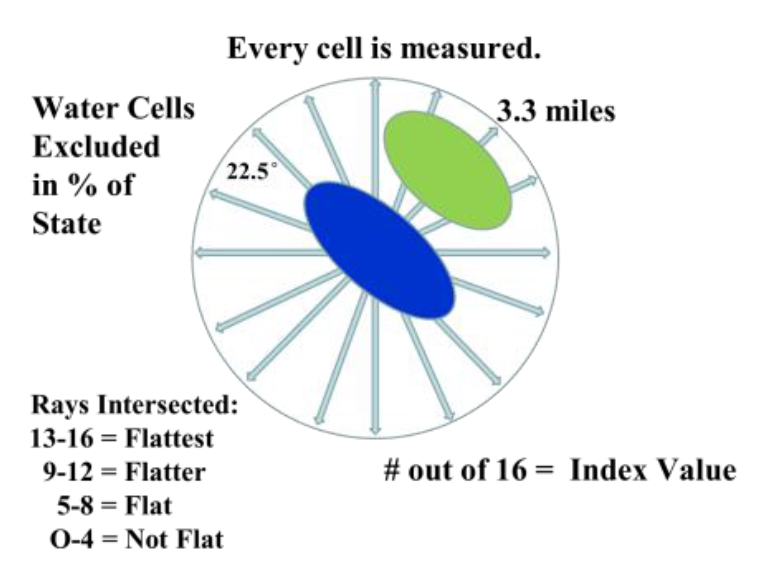
The first attempts to model flatness used a nested approach of slope and relief calculations run at different focal window sizes that were then combined into an index score. However, they just didn’t seem to work that well. To start I was only working on a Kansas subset and compared various model outputs to places I knew well. In researching other analysis functions I came across the r.horizon algorithm. Originally designed for modeling solar radiation, it has an option that traces a ray from a fixed point at a set azimuth, out to a set distance, and measures the angle of intersection of the ray and the terrain. Discovering this function changed my whole approach; it automatically incorporated the distance measure and was only concerned with “up” terrain. To model flat, r.horizon needed to be run for 16 different azimuths, each 22.5 degrees apart, to complete the full 360 degree perspective. Additionally it needed to be run for every raster cell. The output was then 16 different layers, one for each azimuth, with the intersection angle of the ray and the terrain.
Graphic displays how the Flat Index is calculated for every 90 meter cell, using independent measures collected across 16 different directions.
Next I had to determine at what angular measurement flat stopped being flat. This is a subjective decision and one based on my experience growing up on the High Plains. On a return trip to my hometown I surveyed a number of places to get a feel for what was truly flat and what wasn’t. Upon reviewing the topographic maps of those areas, I determined that an upward rise of 100 ft / 30 meters over a distance of 3.3 miles was enough to stop the feeling of “flat as a pancake.” This correlated to an angular measure of 0.32 degrees. Now this measure is completely arbitrary, and it would be interesting to get how others would classify it. I did review it with a few other western Kansas natives who agreed with me. Note, we were not concerned with down elevation at all. This is because canyons and valleys do not impact the perception of flatness until you’re standing near the edge; anyone who’s been a mile away from the South Rim of the Grand Canyon can confirm that you don’t know its there.
Graphic displays the angular measure criteria (0.32 degree) used to make the binary flat/not flat classification.
The data processing for this project was massive, requiring downloading all the individual tiles of the SRTM for the Lower 48 (55 tiles, over 4GB in total size), importing (r.in.gdal), mosaicing (r.patch), setting regions (g.region), then ultimately subsetting into four sections because of a bug in r.horizon (r.mapcalc conditional statements), running r.horizon 16 times on every raster cell in the Lower 48 (1,164,081,047 cells), running the cut point reclassification (r.recode), then compiling the final index score (r.mapcalc). Each segment of the DEM took about 36 hours to process in r.horizon, meaning the entire Lower 48 took about 6 days total.
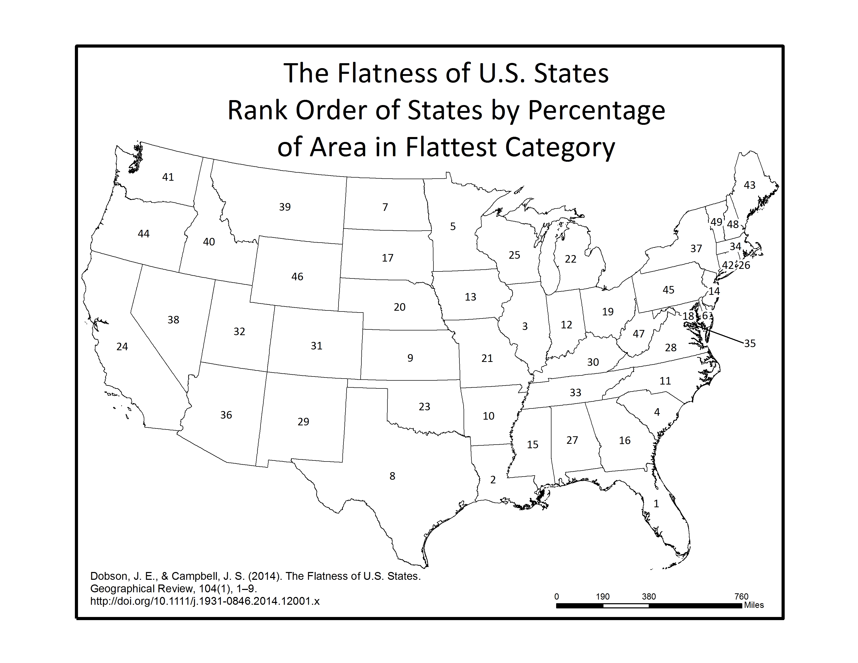
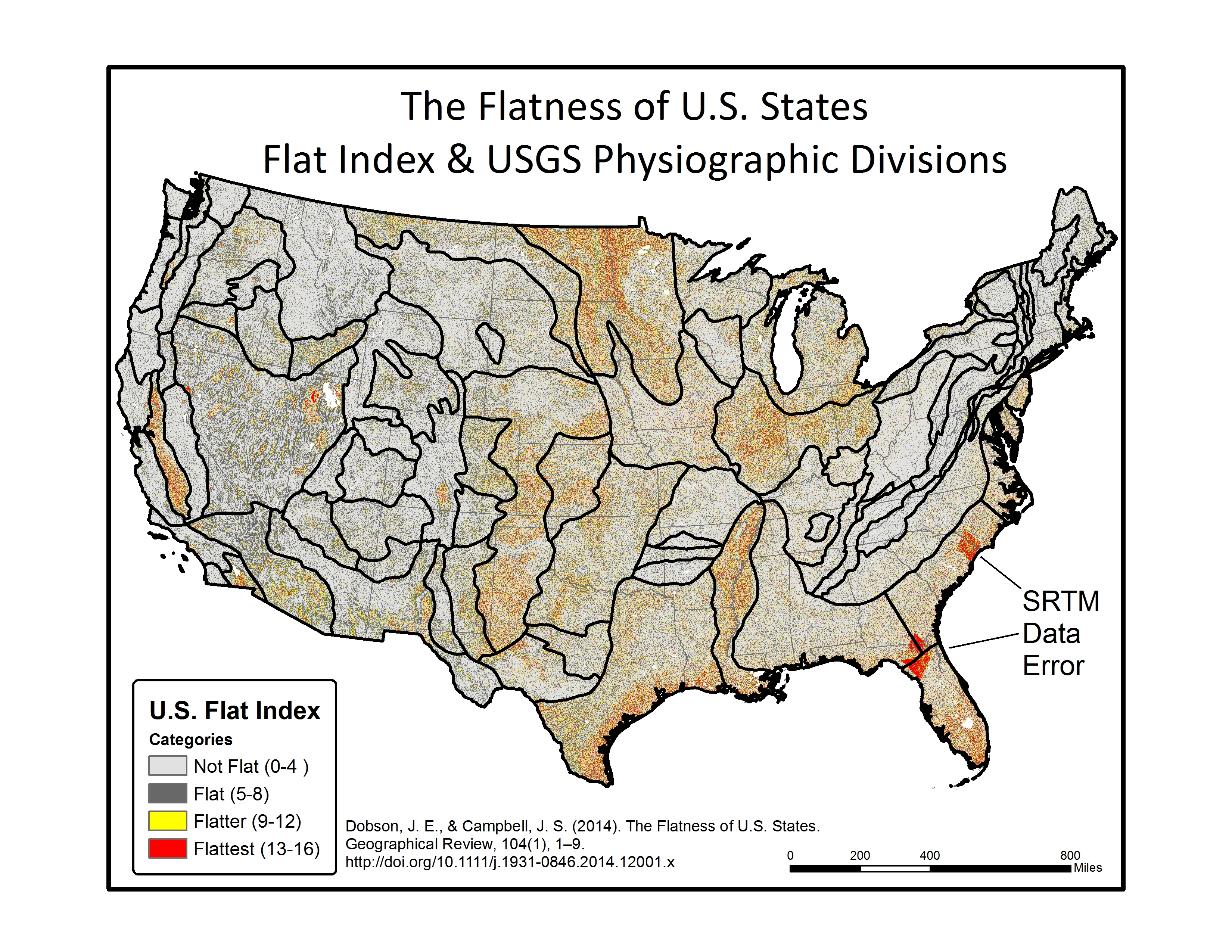
In the final step, each of the 16 individual azimuth scores were added together (r.mapcalc) to create a single index score ranging from 0-16 (0 being non-flat in all directions, 16 being flat in all directions). This index score was divided into four groupings, with Not Flat (0-4), Flat (5-8), Flatter (9-12), Flattest (13-16) categories. Zonal statistics (r.statistics) for each state were extracted from the final flat index, also known as the “Flat Map”, to calculate the rankings for flattest state. A water bodies data layer was used as a mask in the zonal statistics (r.mask) so as to eliminate the impact of flat surface water elevations (reservoirs and lakes) from the final calculation. A second mask was also used to eliminate the influence of two areas of bad data located in the southeastern U.S., mainly in Florida and South Carolina. Both total number of flat pixels and percent area flat pixels were calculated and ranked for the flat, flatter, and flattest categories. See the article below for a table of results.
Results
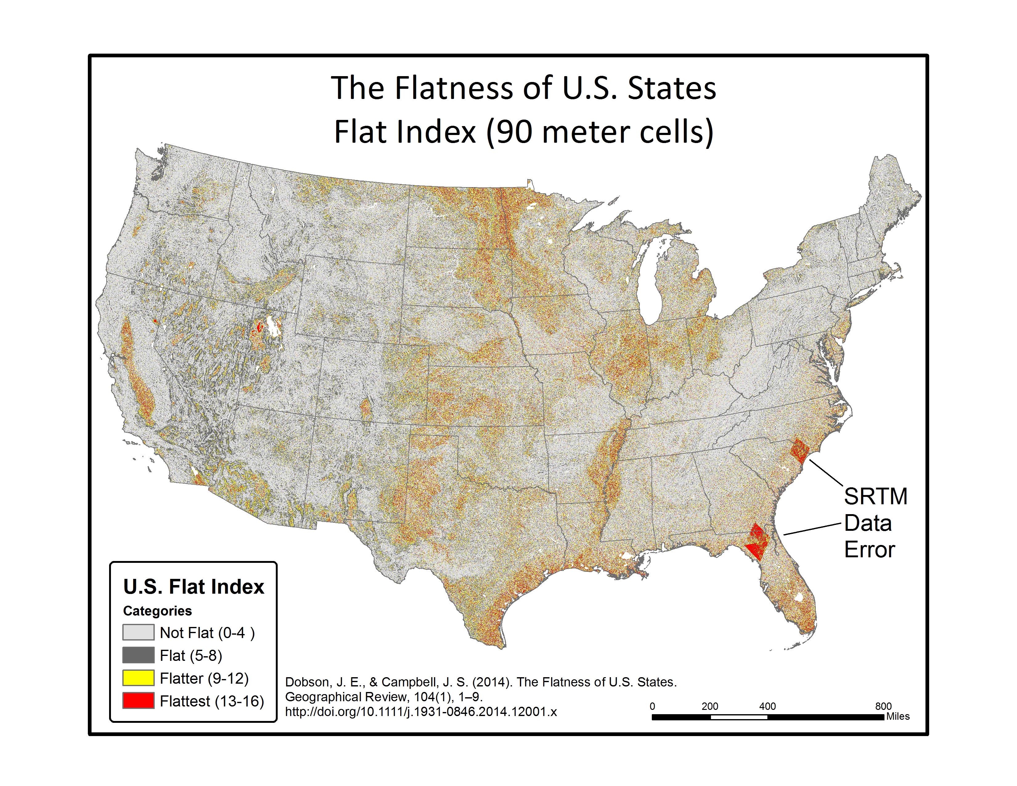
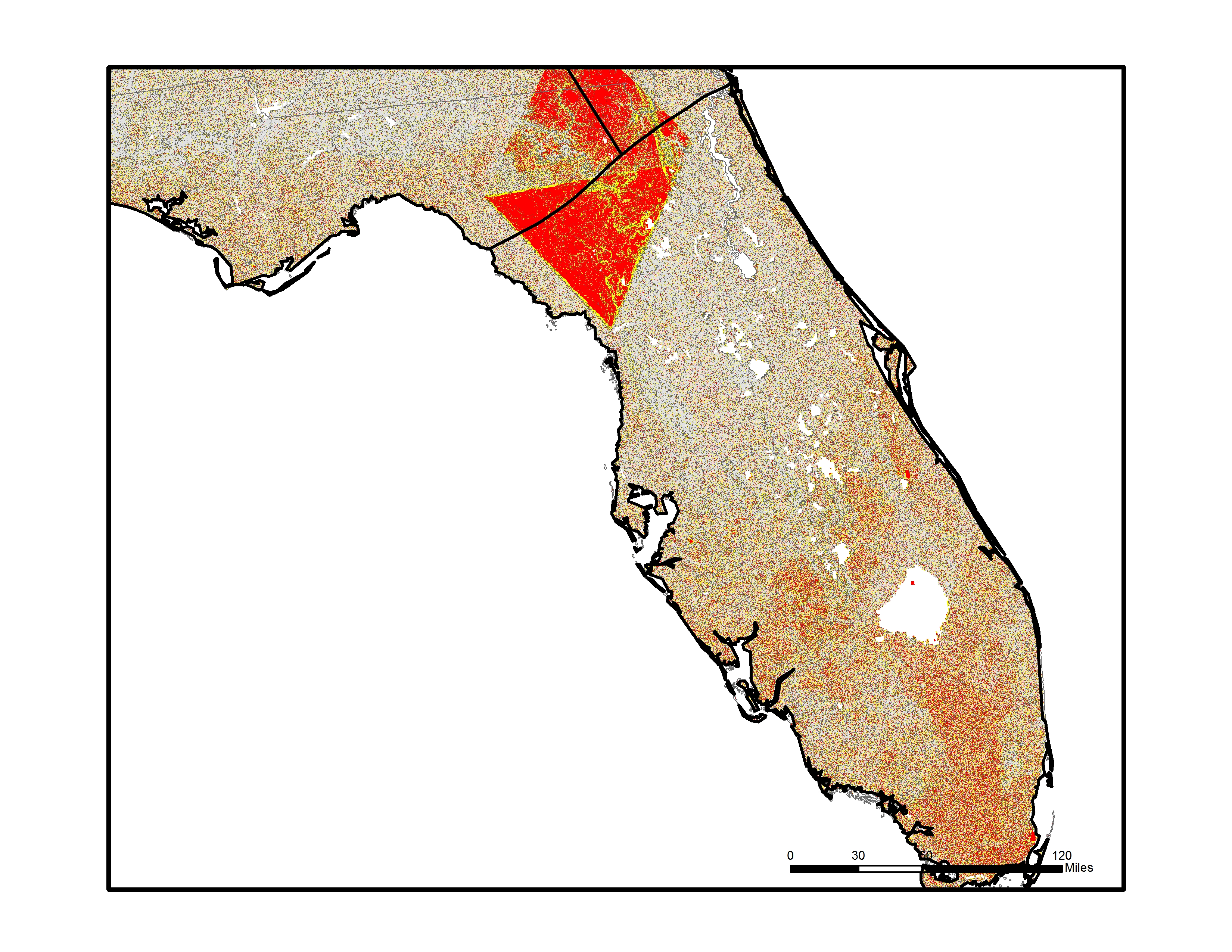
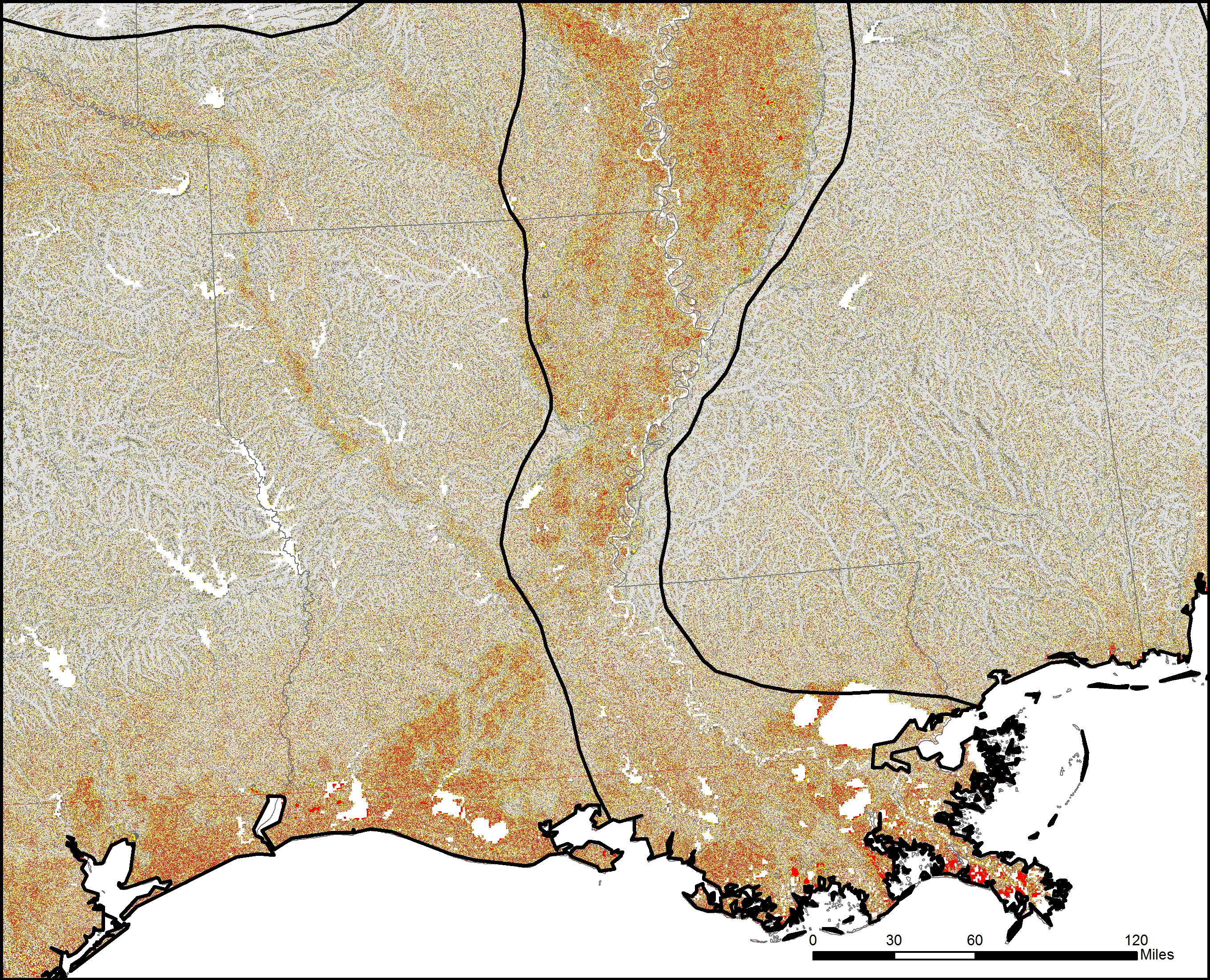
Below are a series of maps that display the final Flat Index. The spatial distribution of flat areas is intriguing, with some confirmations and surprises to our initial hypotheses. Interesting areas include the Piedmont and coastal plains of the eastern coastal states, Florida and the coastal areas of the Gulf States, the Red River Valley in Minnesota and North Dakota, the glacial outwash in Illinois and Indiana, the Lower Mississippi River valley, the High Plains region of the Great Plains, the Basin and Range country of the Intermontain West, and the Central Valley of California. A complete table of the state rankings is available in the article, and there are several more zoomed in maps available below. Each image is clickable and will open a much larger version.
Map shows the Flat Index, a.k.a the “Flat Map”, for the Lower 48 of the United States.
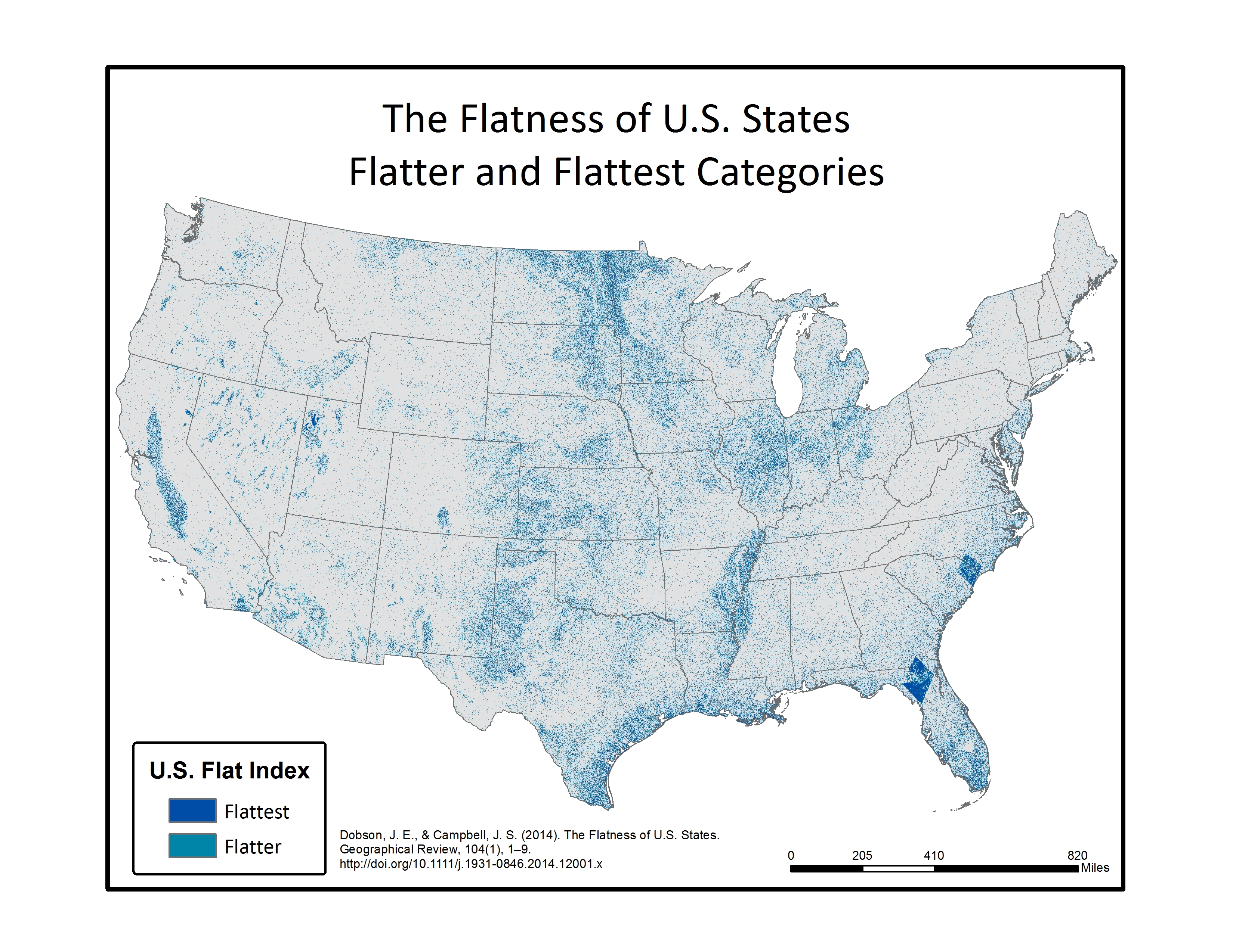
Map displays the Flatter and Flattest Categories of the Flat Index. Useful for visualizing the patterns of flat lands within the continental United States.
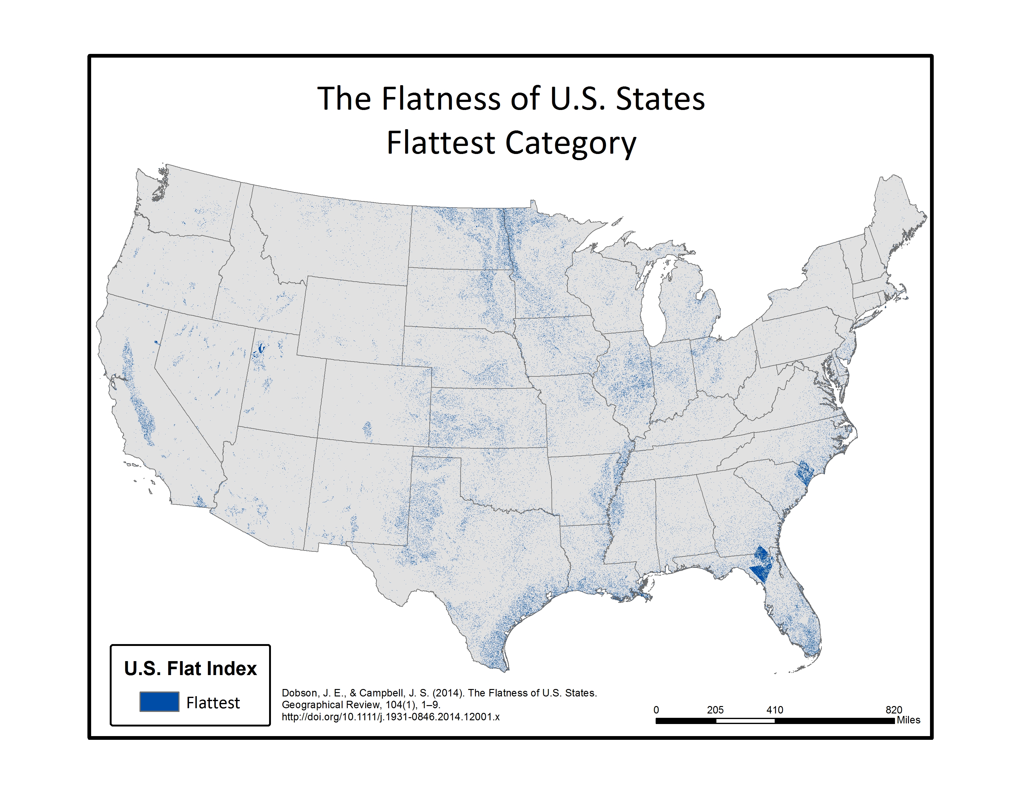
Map displays the Flattest Category of the Flat Index. These are the areas that can be called “flat as a pancake.”
Rank order of States by the percentage of their area in the Flattest class. As initially thought, Kansas isn’t even close to the flattest.
Media
The media response to what Jerry Dobson, my coauthor and PhD advisor, and I refer to as the “Flat Map” took me by surprise. Jerry was always confident it would be well received, but the range of international, national, and regional coverage it received was beyond anything I imagined…and it keeps going.
As an added bonus, in the spring of 2017 renowned science blogger Vsauce featured the Flat Map in the a video about “How Much of the Earth Can You See at Once” (see video below). With over 4.5M views so far, this has to be most coverage the Flat Map has received. I recommend the entire video, and the Flat Map section begins around the 10:30 mark.
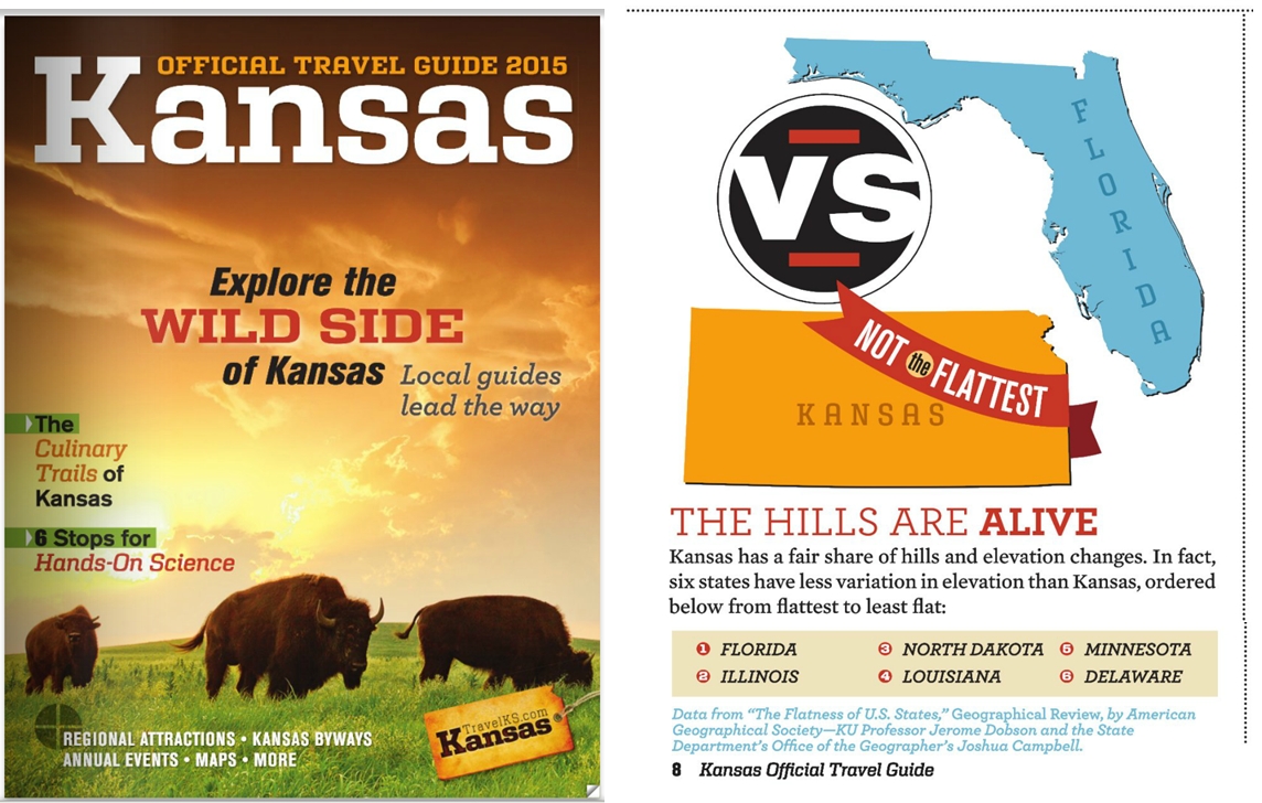
And this little gem from the 2015 Kansas Official Travel Guide…that’s right, the Flat Map made the Tourism Guide. In the very chippy AIR response to the Flat Map, the AIR editors indicate they got a call from the Kansas Director of Tourism. I’ll take this.
Does the perception of flatness impact tourism? Seems the State of Kansas is interested in projecting that the Kansas landscape has hills.
More Maps
Map shows the Flat Index for the Lower 48 of the United States overlaid with the boundaries of the USGS Physiographic regions. Interesting correlation between flat areas and physiographic boundaries.
Map displays the Flat Index over Florida, note large areas of flat land in southern half of the state and along the panhandle coast.
Map shows the Flat Index over Louisiana and the Lower Mississippi Valley. Large areas of flat lands occur within the river valley and along the coastal areas.
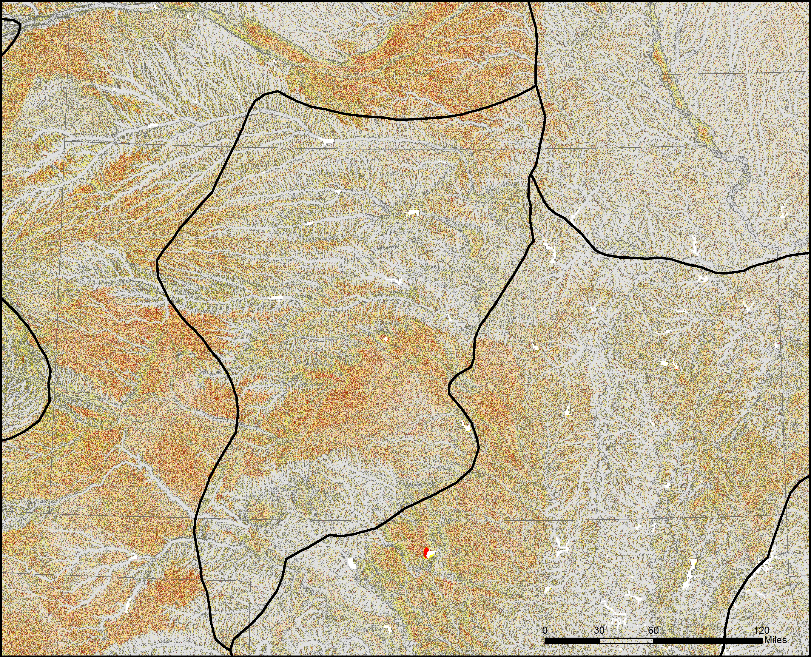
Map shows the Flat Index over Illinois and Indiana. Note the huge area of Illinois within the Flattest class, the result of glacial outwash geomorphic processes.
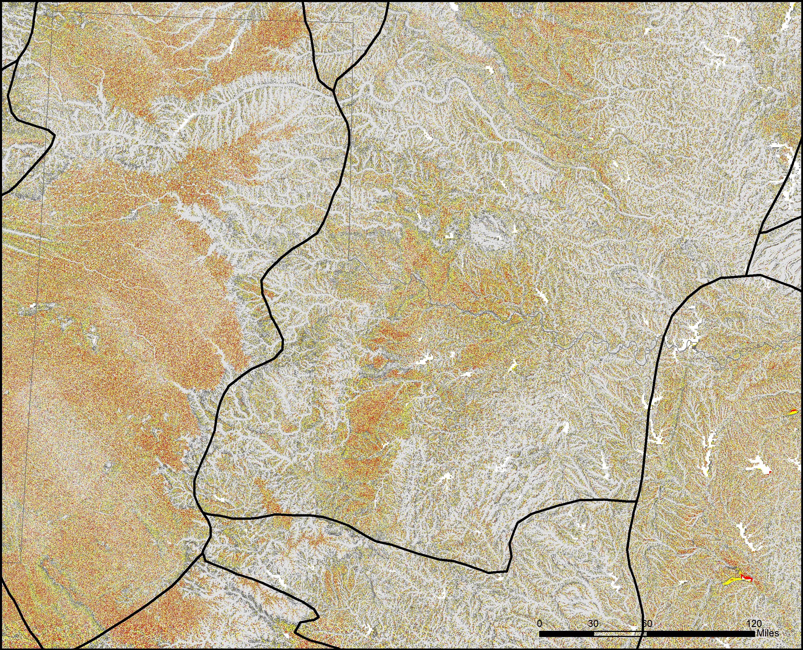
Map shows the Flat Index over northern Texas and Oklahoma. Note large tracts of flat land in the western High Plains region.
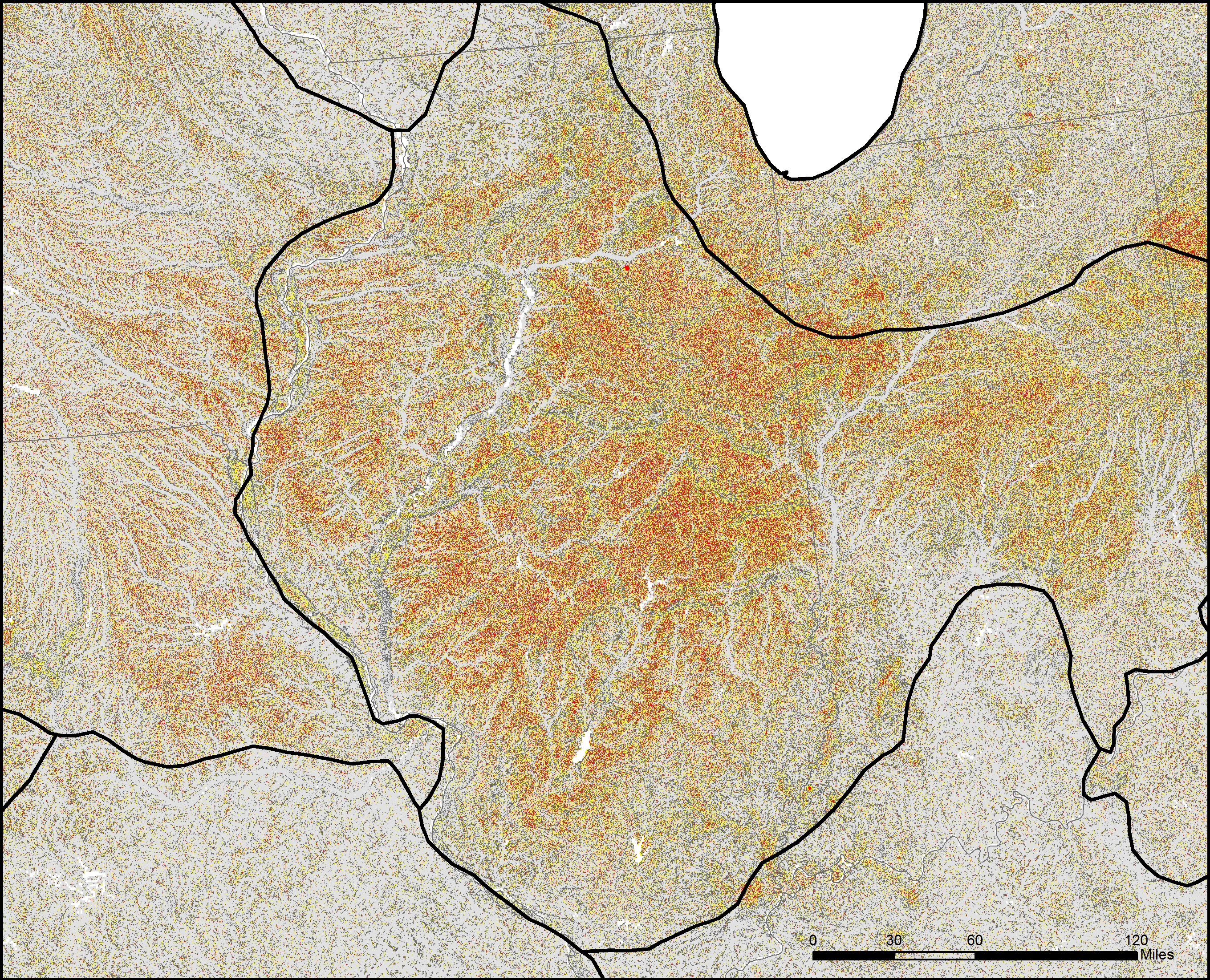
Map shows the Flat Index over Kansas. Note large areas of flat land in the western High Plains region and in the central area of the state corresponding to the Arkansas River valley and McPherson-Wellington Lowlands physiographic province.
Thanks
I would like to thank Dr. Jerry Dobson for his efforts on this paper. We worked together conceptualizing “flat” and how to build a novel, terrain-based, and repeatable method for measuring it. It was a long road to get the Flat Map out to the world, and Jerry was a constant source of inspiration and determination to get it published. When I was swamped with work at the State Department, Jerry pushed forward on the write up and talking with the media.
Future
In terms of the future, there is much more that can be done here. New distributed raster processing tools (Mr. Geo and GeoTrellis) could rapidly increase processing speeds, and provide an opportunity for using a more refined, multi-scalar approach to flatness. New global elevation datasets are also becoming available, and could potentially reduce the error of the analysis through lower margins of error in forested areas. If I was to do it again, the USGS National Elevation Datasets, particularly at the 30 meter and even 10 meter resolution, would be a great option for the United States. On the perception front, the terrain analysis results could be compared with landcover data to determine how landcover affects perception. Social media polling could also gather a huge amount of place-based data on “Is your location flat?” and “Is your location boring?”. I would also like to get the data hosted on web mapping server somewhere, so people could interact with it directly. A tiled map service and the new Cesium viewer would be a great tool for exploring the data. If anyone is interested in working together, let me know.
Article
Below is a pre-publication version of the article submitted to Geographical Review. Please cite the published version for any academic works.
Just wanted to let everyone know that I am moving on from Boundless. It was a fascinating ride, and I learned a lot about startup life. Launching a new product is a true challenge, requiring a deft hand to manage all the constituent elements of the business. We got close, but strategic priorities required a narrower product focus. I wish everyone there well, the company has a bounty of talented people and the sky’s the limit.
Moving forward, I am going to take the next couple of months to finish my dissertation in Geography (stay tuned, lots coming on MapGive, Imagery to the Crowd, and disruptive innovation). Completing the PhD is my focus, but I’m looking forward to exploring new options. I’m open to continuing down the product management and private sector paths, but I also miss the analytical and complex emergency focus of my previous work. I’ll be reaching out to friends around town and beyond, and if anyone has any suggestions, please let me know.
With the growth in open source software, cloud computing, open data, imagery, point clouds, and the Internet of Things, there are going to be an amazing array of new opportunities for geographers. So regardless of what comes next, I will continue to use geographic data, tools, and analysis to disrupt existing workflows and business models, and strive to make the world a better place.