A recent article on the most remote places in America struck a cord with me. The article, published by the Washington Post, utilizes recent work on global travel times that models the transportation networks between any two places on earth, using a range of transportation options. This work, A global map of travel time to cities to assess inequalities in accessibility in 2015, is a tremendous achievement of spatial data aggregation, topological connectivity, and spatial modeling, and is worthy of a post in and of itself.
That said, it was the work done by the Post , using the Global travel time data to determine remote places in the United States that caught my attention. In looking at the map (Figure 1 below), it takes a second to understand what is being modeled. The details are spelled out quite clearly in the article, but of course, I looked through the map first.
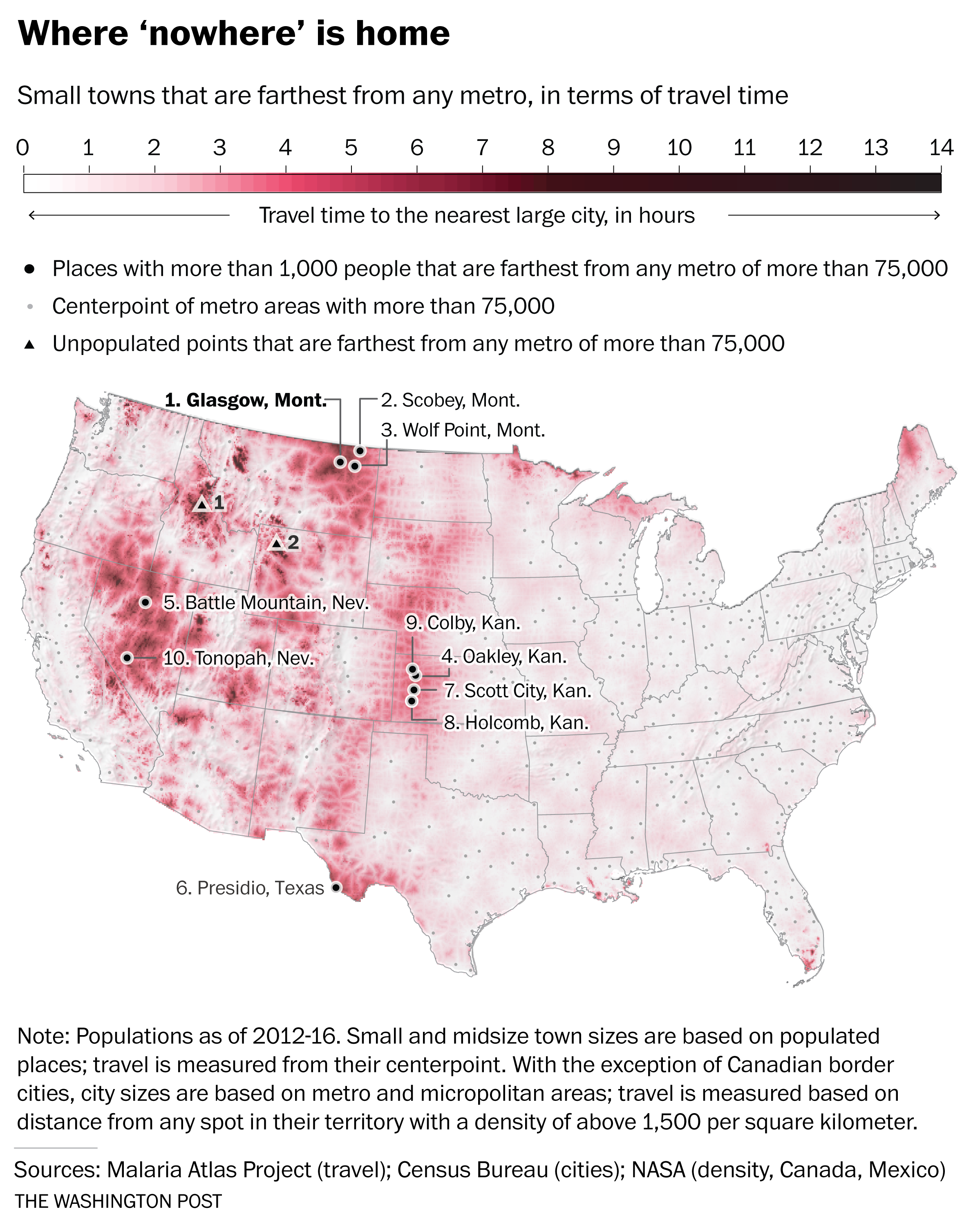
Figure 1: Map of travel times in the United States, originally from Washington Post article published February 20, 2018
When you think of “remote”-ness, the first thing the comes to mind is a desolate mountain cabin or desert camp. And the map above does highlight the two places with the longest travel times in the Lower 48. However, this is an absolute value of remoteness, a one way path. The more interesting component of this analysis is the comparative definition of remote…where the travel time between two actual locations is calculated. The desolate mountain cabin is the domain of a single person…what does it mean to be remote when you live in an actual town?
In this analysis, the travel time between every location in the Lower 48 U.S. and the nearest metropolitan area (city with a population greater than 75,000) is derived from the Global travel data. This creates a continuous surface where every 1,000m x 1,000m grid cell contains a travel time. When mapped, this data forms a type of “travel-shed” map that is reminiscent of hydrologic and watershed maps. Commensurately, the boundaries of the travelsheds are the areas with the largest travel times, and help delineate regional zones where a particular city is dominant. The travel speed of various transport modes are also reflected in the data, e.g., interstates are faster than secondary highways, and that fact imprints a pattern where the fastest paths resemble river valleys in the travelsheds. Finally, the ridges between travelsheds provides the “remote” areas, farthest away from population centers.
From a macro perspective, the highly populated eastern U.S. shows much lower variation in travel times when compared with the more sparsely populated areas of the Great Plains, Rocky Mountains, and intermontane areas of the western states. This is a combination of higher overall population and a fairly even distribution of populated places…essentially there are so many people that it’s hard to get too far from a larger town. Notable areas of high travel times include the intermontane areas of Utah and Nevada, the Trans-Pecos region of West Texas, and an interesting ridge through the mid continent that roughly follows the western extent of the High Plains physiographic region.
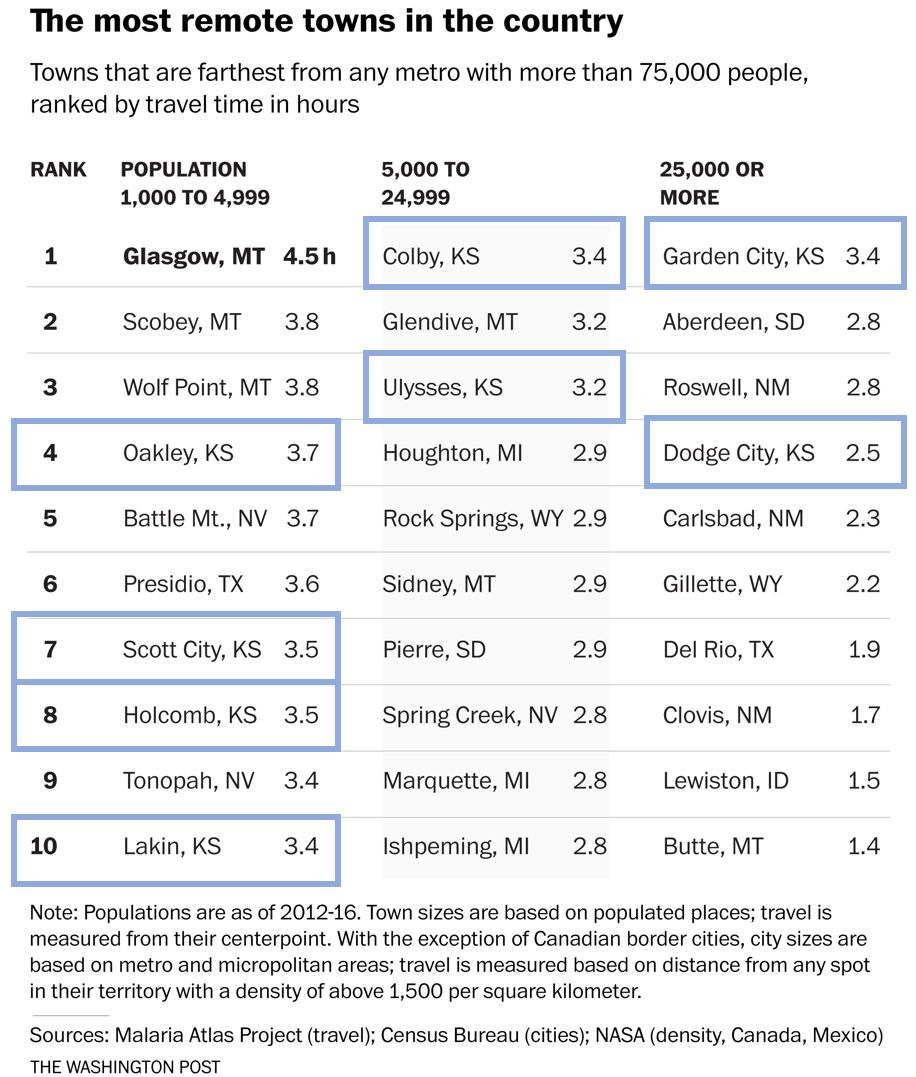
In the next step of the analysis, the travel time layer is intersected with the location of all American cities greater than 1,000 people, and the travel time between the small city and the nearest city of 75,000 people was calculated. Brilliant. In fact, they did the same analysis comparing towns with population larger than 1,000, 5,000, and 25,000. The ranked list of cities is displayed in Figure 2 below.
Figure 2: Ordered list of most remote towns in the Lower 48 U.S., with the Kansas High Plains towns highlighted (added for this blog post). Originally published in the Washington Post article published February 20, 2018
So why is this significant to me? Beyond being a super slick GIS application, two other reasons. First, I grew up in southwest Kansas, an area that I have often described to people as being about as far away from anything as you can get in this country…and it turns out, I was right. My hometown is #10 on the list…and four other locations in the top 10 of the small towns list are its neighbors. Additionally, other towns in southwest Kansas top the most remote in the mid- and large- town lists. The longitudinal ridge of “remoteness” that extends along the 107 degree west longitude line seems to be a “travel-shed” boundary between the populated places of the Colorado Front Range and those in eastern Kansas.
The second interesting element of this analysis is how it compares to my previous work on “flatness”. I haven’t done any quantitative work on this, but a visual comparison of the two maps seems to show a bimodal distribution of remote places…they are either very flat or very not flat. Conjecture could lead one to intuit that flat places are remote because they may be uninteresting to live, while not flat place are remote because it is difficult to get to them.
But I think that is simplistic, the flat remote places are instead driven by the economic geography of the region. For southwest Kansas, that means an economy dominated by agriculture…a lifeway that increasingly requires less and less people, but that still demands population centers at regular intervals to efficiently collect and transport the harvests. This leads to the mix of low population, that is regularly dispersed, and occupies flat terrain. Compare this to the remote area of central Nebraska, which is also on the 107 degree meridian, but that doesn’t appear in this list because there are no settlements that exceed 1,000 people. The Sand Hills mean there is no agriculture, no economic lifeway that requires any substantial grouping of people.
In conclusion, this list of towns reads like a schedule of summer swim meets from my youth…and it’s just bizarre to see it spelled out in a national newspaper. These places that I know well, that I spent significant parts of my life studying the archaeological and climatic past of…are in fact, some of the most remote, yet connected, places in the United States. And now having spent almost 10 years in DC, I’ve come to appreciate just how far the cultural distance is between these remote outposts and the populated centers of the coastal U.S.
The human geographies that occupy these urban / rural divides is tremendous, and there is no clear path between them. Communication technology has shrunk these distances, whether it be the satellite dishes that were prevalent in my youth, or the internet now, technology has homogenized the cultural experience to a large degree…overcoming the limitations of spatial distance. But these areas do feel “remote”, they are a long way, both in culture and travel distance, from the economic and cultural engines of our society.
It is interesting that the original goal of the global travel time data was to assess the inequalities that become manifest when the accessibility to cities is limited. The value of this data for the Sustainable Development Goals (SDG) is clear, and I think will be used in a myriad of ways to plan and contextualize international development efforts. But what does it mean for our society, what does being remote inside the United States mean? What inequalities will become manifest for our own citizens as accessibility to cities remains limited? Maybe this map should be used for some domestic sustainable development?
And while it was the personal connection to my life that drew me to this work, it is clear the data and methodology presented here do offer an valuable framework for understanding the implications of population distribution. In the SDG context, the use of these spatial tools will positively impact development planning and execution, and the team who compiled this data should be applauded. The geospatial revolution continues…
Weiss, D. J., Nelson, A., Gibson, H. S., Temperley, W., Peedell, S., Lieber, A., Hancher, M., Poyart, E., Belchior, S., Fullman, N., Mappin, B., Dalrymple, U., Rozier, J., Lucas, T. C. D., Howes, R. E., Tusting, L. S., Kang, S. Y., Cameron, E., Bisanzio, D., … Gething, P. W. (2018). A global map of travel time to cities to assess inequalities in accessibility in 2015. Nature, 553(7688), 333–336. https://doi.org/10.1038/nature25181Cite
As likely everyone in the geo world knows by now, the widely awaited release of QGIS 2.0 was announced at FOSS4G this week. Having closely watched the development of QGIS 2.0 I was eager to get it installed and take a look at the new features. I am for the most part a Windows user, but I like to take the opportunity to work with the open source geo stack in a Linux environment. My Linux skills are better than a beginner, but because I don’t work with it on a daily basis, those skills are rusty. So I decided this is a good excuse to build out a new Ubuntu virtual machine, as I haven’t upgraded since 10.04.
Build Out The Virtual Machine
Let’s just say I was quickly faced with the challenges of getting Ubuntu 12.04 installed in VMware Workstation 7.1. Without getting into details, the new notions of “Easy Install” and its effect on installing VMware Tools took a while to figure out. In case anyone has the Easy Install problem, this YouTube video has the answer, also posted in code below:
The second problem, about configuring VMware Tools with the correct headers, is tougher. I’m still not sure I fixed it, but given its rating on Ask Ubuntu, it’s obviously a problem people struggle with. Suffice it to say there is no way that I could have fixed this on my own, nor do I really have a good understanding of what was wrong, or what was done to fix it.
The Open Source Learning Curve
This leads me to the point with this post, open source is still really tricky to work with. The challenges in getting over the learning curve leads to two simultaneous feelings: one, absolute confusion at the problems that occur, and two, absolute amazement at the number of people who are smart enough to have figured them out and posted about it on forums to help the rest of us. While its clear the usability of open source is getting markedly better (even from my novice perspective), it still feels as if there is a “hazing” process that I hope can be overcome.
QGIS 2.0 Installation
With that in mind, here is some of what I discovered in my attempt to get QGIS 2.0 installed on the new Ubuntu 12.04 virtual machine. First, I followed the directions from the QGIS installation directions, but unfortunately I was getting errors in the Terminal related to the QGIS Public Key, and a second set on load. Then I discovered the Digital Geography blog post that had the same directions, plus a little magic command at the end (see below) that got rid of the on load errors.
sudo chown -R "your username" ~/.qgis2
After viewing a shapefile and briefly reviewing the new cartography tools, I wanted to look at the new analytical tools. But there was a problem, and they didn’t load correctly. So back to the Google, and after searching for a few minutes I found the Linfinty Blog on making Ubuntu 12.04 work with QGIS Sextante. After a few minutes downloading tools I check again, this time the image processing tools are working, but I keep getting a SAGA configuration error. After figuring out what SAGA GIS is, and reading the SAGA help page from the error dialog box, it was back to searching. The key this time was a GIS Stack Exchange post on configuring SAGA and GRASS in Sextante, this time the code snippet of glory is:
sudo ln -s /usr/lib64/saga /usr/lib/saga
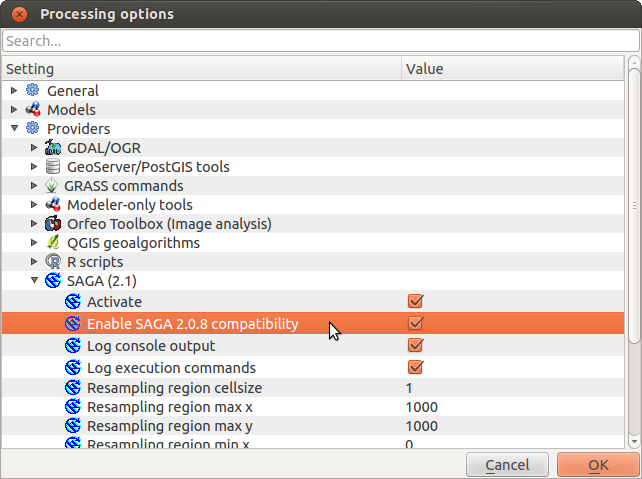
Next, back to QGIS to fire up a SAGA powered processing routine, and the same error strikes again. More searching and reading, now its about differences in SAGA versions and what’s in Ubuntu repos. With no clear answer, I check the Processing options in which there is an “Options and Configuration”, which has a “Providers” section, which as an “Enable SAGA 2.0.8 Compatibility” option. Upon selecting the option, boom, the all the Processing functions open. Mind you I haven’t checked whether they actually work, after several hours they now at least open.
“Processing” configuration options in QGIS 2.0
Conclusion
It is clear that the evolution of open source geo took several steps forward in this last week, and the pieces are converging into what will be a true end-to-end, enterprise-grade, geographic toolkit. And while usability is improving, in my opinion, it is still the biggest weakness. Given the high switching costs for organizations and individuals to adopt and learn open source geo, the community must continue to drive down those costs. It is unfair to ask the individual developers who commit to these projects to fix the usability issues, as they are smart enough to work around them. Seems to me it is now up to the commercial users to dedicate resources to making the stack more usable.
The Humanitarian Information Unit (HIU) has released several new datasets that leverage the Office of the Geographer‘s work on mapping International Boundaries. The Large Scale International Boundaries (LSIB) dataset, maintained by the Geographic Information Unit (GIU), is a vector line file that is believed to be the most accurate worldwide (non-Europe, non-US) international boundary vector line file available. The lines reflect U.S. government (USG) policy and thus not necessarily de facto control (cited from metadata attached to files). In September 2011, the HIU first released the boundaries publicly for download. Working with colleagues at DevelopmentSeed after that release, they made some substantial improvements to the underlying data structure that helped lead to this work.
The LSIB dataset is designed for cartographic representation and map production. However, this poses a problem for GIS analysis, because the dataset is only composed of vector lines of terrestrial boundaries between countries. This means they do not contain coastlines, and could not be converted into polygons for GIS analysis. To address this issue, the HIU combined the LSIB dataset with the World Vector Shorelines (1:250,000) dataset. The combination of these two datasets is one of the highest resolution country polygon datasets available. Additionally, the LSIB-WVS polygon file is believed to be the most accurate available dataset for determining island sovereignty. It corrects the numerous island sovereignty mistakes in the original WVS data (cited from metadata attached to files).
Two other modifications were made to the datasets. First, the large cartographic scale of the data also introduces a problem in that the data are too detailed for global scale mapping. Therefore, the HIU also created “generalized” versions of the original LSIB-WVS polygons that are suitable for smaller scale mapping. Second, in order to facilitate the ability to “join” data to the polygons in a GIS, several attributes were added to the database, including Country Name and several ISO 3166-1 Country Codes (ISO Alpha 2, ISO Alpha 3, and ISO Number). After a year of work, the data have been released into the public domain.
All datasets can be downloaded from the HIU Data page or the links below:
Note, both the polygon and line datasets are useful for cartographic representation. This is due to the variety of different boundary classifications that are in the LSIB. Below is a subset from the metadata attached to the datasets that describes USG cartographic representation of the boundary lines.
From the LSIB lines metadata: The “Label” attribute field provides a name for any line requiring non-standard depiction, such as “1949 Armistice Line” or “DMZ”
The “Rank” attribute categorizes lines into one of three categories:
a) A rank of “1” (includes most of the 320 international boundaries) for those which the USG considers “full international boundaries.”
b) A rank of “3” for other lines of international separation. Most are considered by the US government to be in dispute.
c) A rank of “7” for other lines of separation such as DMZ’s, No-Mans Land (Israel), UNDOF zone lines (Golan Hts.), Sudan’s Abyei, and for the US Naval Base Guantanamo Bay on Cuba.
Any line with a rank of “3” or “7” is to be dotted or dashed differently and in a manner visually subordinate to the normal rank “1” lines.
Additional information about how the LSIB dataset is produced, and the processes that went into the production of the new datasets are included in the metadata.
And for more information about the Office of the Geographer, see the article from State Magazine below:
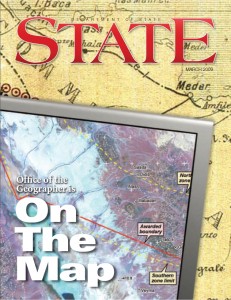
Article about the Office of the Geographer from State Magazine in March 2009
Available immediately, the U.S Department of State is looking to fill two positions related to geographic analysis and geographic programming. The Office of eDiplomacy, the State Department’s knowledge management gurus, want to build a first-rate geographic application development team. The two-person team will work with DoS bureaus to understand their workflows, leverage the geographic components of their data, and build custom geographic applications to help them. The team will be composed of one GIS applications developer, and one GIS analyst. Each position will require a substantial overlap in skills, meaning the developer must understand GIS analysis and the analyst will have to have some programming experience.
In that capacity, I started a project to build a completely open source geographic computing infrastructure focused on humanitarian applications. Called the CyberGIS, this project is built exclusively from open source geographic technology including, PostGIS/PostgreSQL, GeoServer, TileCache, OpenLayers, and TileMill, along with the standard Ubuntu, Apache, Tomcat, jQuery components, and we host our production environment in Amazon Web Services. Using the term CyberGIS was intentional and intended to place the project inline with on-going efforts in the academic community to unite the worlds of geographic information science and cyberinfrastructure.
We have used this infrastructure to build several HIU geographic web applications, including the Imagery to the Crowd projects. These award winning projects are just the beginning for the CyberGIS at the HIU, we have several applications under development that we hope to unveil publicly in the coming months. The success of the HIU CyberGIS has raised the attention of geography in the Department, and the fact that eDiplomacy is building this development team is a huge step in expanding the power of Geography to the entire State Department. Two years ago I could not have expected that we could move this far this fast, and now we have an opportunity to fundamentally influence how the Department operates.
The Ask
If you have serious GIS analysis and open source geographic developer skills and want to be part of a geographic revolution, then I encourage you to apply. We need forward leaning, capable folks who fundamentally understand spatial analysis and geographic technololgy. You must be willing to work hard and be leaders in showing how geographic data and analysis can improve American diplomacy. This is a unique moment and we need the right team.
The main Careers page on the ActioNet website is here