The Ito World crew is back at it with a new OpenStreetMap visualization, this time for Africa. Results are shown at the continental scale and for selected cities over the last couple years. The final product is stunning, as usual.
Growth in West Africa as part of the Ebola response, and the Nigeria eHealth Import are the most distinctive. Other growth areas include a broad swath of East Africa, and the incredible density of the Map Lesotho project. Most impressive, however, is that the growth is not constrained to these areas; it is distributed across the continent. The missing areas are gradually filling in, it is only a matter of time…
It all started with delicious pancakes and a glorified misconception. In a 2003 article published in the Annals of Improbable Research (AIR), researchers claimed to scientifically prove that “Kansas is Flatter Than a Pancake” . The experiment compared the variation in surface elevation obtained from a laser scan of an IHOP pancake and an elevation transect across the State of Kansas. And while the researchers’ conclusion is technically correct, it is based on two logical fallacies. First, the scale the analysis shrunk the 400 mile-long Kansas elevation transect down to the 18 cm width of the pancake, thereby significantly reducing the variability of the elevation data. Second, pancakes have edges, which creates some significant relief relative to the size of the pancake, approximately 70 miles (!) of elevation if applied to Kansas scale (Lee Allison, Geotimes 2003). Using this approach, there is no place on earth that is not flatter than a pancake.
Now, I can take a joke, and at the time thought the article was clever and funny. And while I still think it was clever, it began to bother me that the erroneous and persistent view that Kansas is flat, and therefore boring, would have negative economic consequences for the state. I grew up on the High Plains of southwestern Kansas, where there are broad stretches of very flat uplands. But even within the High Plains region there are areas with enough relief to certainly not be considered flat as a pancake…and this doesn’t include the other two-thirds of the state.
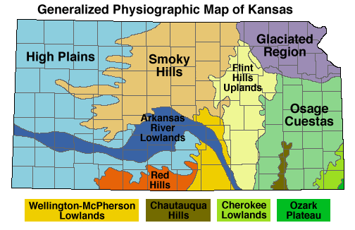
Official Physiographic Regions for the State of Kansas. Note the large number of regions denoted by “hills.”
The joke of it is that the official Physiographic Regions of Kansas Map describes the majority of the state in terms of hills: Flint Hills, Red Hills, Smoky Hills, Chautauqua Hills, Osage Cuestas (Spanish for “hills”). Not to mention the very hilly Glaciated Region of northeastern Kansas, anyone who attended classes on Mount Oread can confirm that for you. And after travelling through other areas of the country, I realized that Kansas isn’t even close to the flattest state.
As luck would have it, a few years after the AIR article I found an opportunity to work on this question of flatness and how to measure it. As part of my PhD coursework I was investigating the utility of open source geospatial software as a replacement for proprietary GIS and needed a topic that could actually test the processing power of the software. Combining my background in geomorphology and soil science with a large terrain modeling exercise using the open source stack offered the perfect opportunity to address the question of flatness. What emerged from that work was published last year (2014) in the Geographical Review as a paper coauthored with Dr. Jerry Dobson entitled “The Flatness of U.S. States” .
The article is posted below, so I won’t rewrite it here, but the central goals were twofold. First, create a measure of flatness that reflected the human perception of flat. This measure needed to be based on how humans perceive flatness, quantitatively based, repeatable, and globally applicable. Second, understand how the general population of the U.S. thinks about flat landscapes, and if there was a bias towards assuming Kansas was the flattest state. This blog post focuses more on the details associated with the first goal, while the article posted below has the description of The American Geographical Society’s Geographic Knowledge and Values Survey that provided data for the second.
Methodology
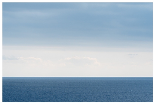
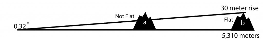
There were many measures of flat that had been developed in the geomorphological literature, but they tended to be localized measures, meant for hydrological and landscape modeling. I wanted something that could capture the sense of expanse that you feel in a very flat place. Beginning with that thought, I tried to imagine a perfect model of flatness. It had to expand in all directions and be vast. The mental model was that of being on a boat in flat seas and looking out at nothing but horizon in all directions. With a little research, I discovered there is an equation for determining how far you can see at sea. It is height dependent, both for the observer and the object of observation, and it calculates that a 6 foot / 1.83 m tall person, looking at nothing on the landscape (object of observation = 0 ft), can see 5,310 meters before the curvature of the earth takes over and obscures view. This was a critical variable to determine, the distance measure for capturing the sense of “flat as a pancake” is 5,310 meters (at a minimum).
A conceptual model of flatness.
With perception model and distance measure in hand, I needed to determine what the appropriate digital elevation model to use. Even though the study area for this paper is the Lower 48 of the United States, a global dataset was needed so that the methodology could be applied globally. The NASA Shuttle Radar Topography Mission (SRTM) data that had been processed by the Consortium of International Agricultural Research Centers (CGIAR) Consortium for Spatial Information (CSI) was the best choice. Specifically 90 meter resolution SRTM Version 4.1 was used, and is available here: http://srtm.csi.cgiar.org/.
In terms of software, the underlying goal of this project was to use only open source software to conduct the analysis. This meant I had to become familiar with both Linux and the QGIS and GRASS workflows. I built an Ubuntu virtual machine in Virtual Box (eventually switching to VMware Workstation) with QGIS 1.2 and Grass 6.3 with the QGIS plugin; by the time I finished the project I was using Ubuntu 10.04, QGIS 1.8 and GRASS 6.4 (and sometimes GRASS 7.0 RC). You don’t realize how much “button-ology” becomes ingrained until you have to switch toolkits, and the combined Windows to Linux and ESRI to QGIS/GRASS transition was rough at times. There were times I knew I could complete a task in seconds in ArcGIS, but spent hours figuring out how to do it in QGIS and GRASS. However, it is worthwhile to become facile in another software as it reinforces that you have to think about what you are doing before you start pushing buttons.
The open source stack has come a long way since I started this project back in 2009, with usability being the greatest improvement. It is a lot easier now for a mere mortal to get up and running with open source than it was then, and the community continues to make big strides on that front. From a functionality standpoint, I did some comparisons between GRASS (Windows install) and ArcGIS 9.2 GRID functions and found that they were very equivalent in terms of processing speeds. It seems there are only so many ways to perform map algebra; note, I discuss the new game-changing approaches to distributed raster processing at the end.
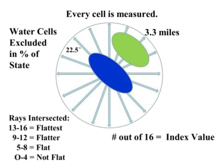
The first attempts to model flatness used a nested approach of slope and relief calculations run at different focal window sizes that were then combined into an index score. However, they just didn’t seem to work that well. To start I was only working on a Kansas subset and compared various model outputs to places I knew well. In researching other analysis functions I came across the r.horizon algorithm. Originally designed for modeling solar radiation, it has an option that traces a ray from a fixed point at a set azimuth, out to a set distance, and measures the angle of intersection of the ray and the terrain. Discovering this function changed my whole approach; it automatically incorporated the distance measure and was only concerned with “up” terrain. To model flat, r.horizon needed to be run for 16 different azimuths, each 22.5 degrees apart, to complete the full 360 degree perspective. Additionally it needed to be run for every raster cell. The output was then 16 different layers, one for each azimuth, with the intersection angle of the ray and the terrain.
Graphic displays how the Flat Index is calculated for every 90 meter cell, using independent measures collected across 16 different directions.
Next I had to determine at what angular measurement flat stopped being flat. This is a subjective decision and one based on my experience growing up on the High Plains. On a return trip to my hometown I surveyed a number of places to get a feel for what was truly flat and what wasn’t. Upon reviewing the topographic maps of those areas, I determined that an upward rise of 100 ft / 30 meters over a distance of 3.3 miles was enough to stop the feeling of “flat as a pancake.” This correlated to an angular measure of 0.32 degrees. Now this measure is completely arbitrary, and it would be interesting to get how others would classify it. I did review it with a few other western Kansas natives who agreed with me. Note, we were not concerned with down elevation at all. This is because canyons and valleys do not impact the perception of flatness until you’re standing near the edge; anyone who’s been a mile away from the South Rim of the Grand Canyon can confirm that you don’t know its there.
Graphic displays the angular measure criteria (0.32 degree) used to make the binary flat/not flat classification.
The data processing for this project was massive, requiring downloading all the individual tiles of the SRTM for the Lower 48 (55 tiles, over 4GB in total size), importing (r.in.gdal), mosaicing (r.patch), setting regions (g.region), then ultimately subsetting into four sections because of a bug in r.horizon (r.mapcalc conditional statements), running r.horizon 16 times on every raster cell in the Lower 48 (1,164,081,047 cells), running the cut point reclassification (r.recode), then compiling the final index score (r.mapcalc). Each segment of the DEM took about 36 hours to process in r.horizon, meaning the entire Lower 48 took about 6 days total.
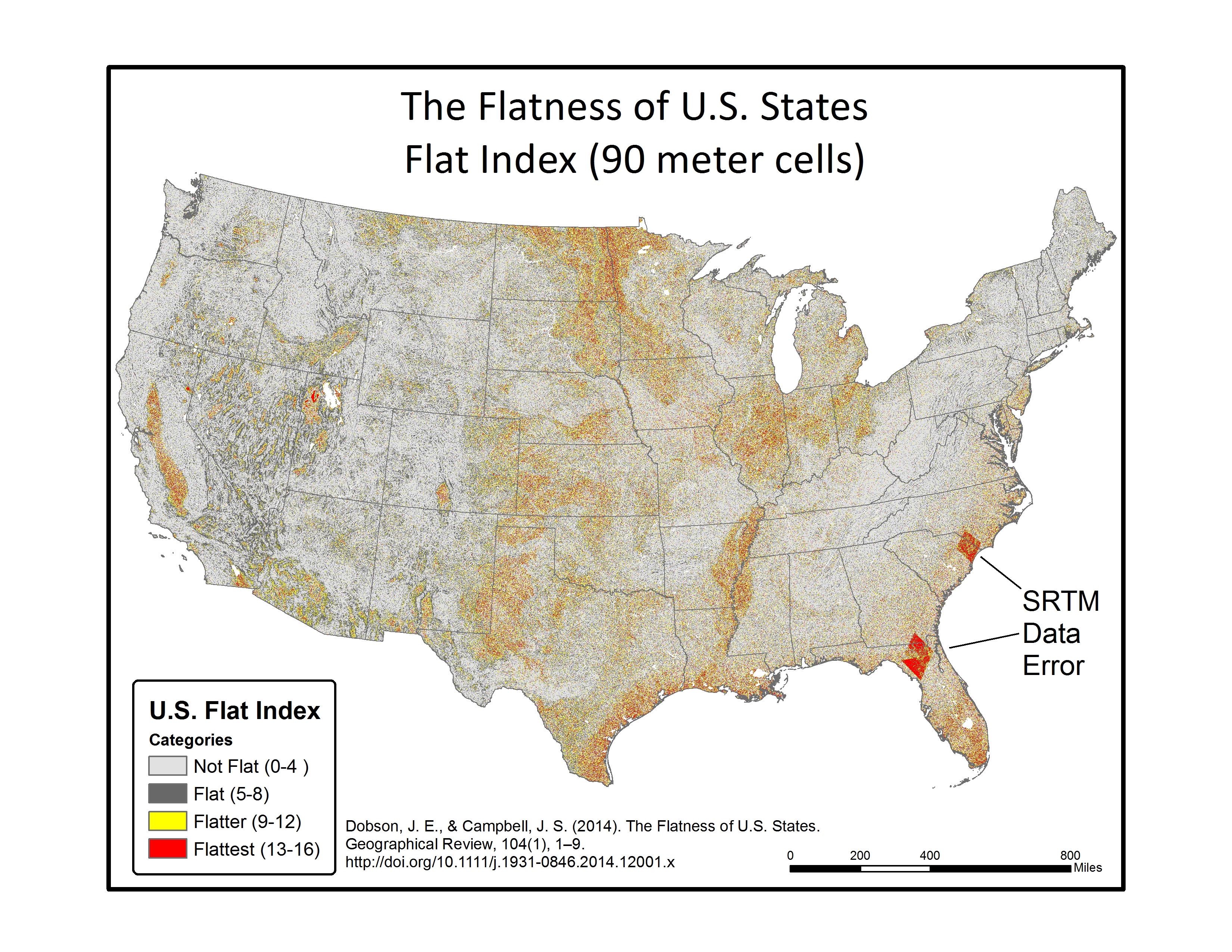
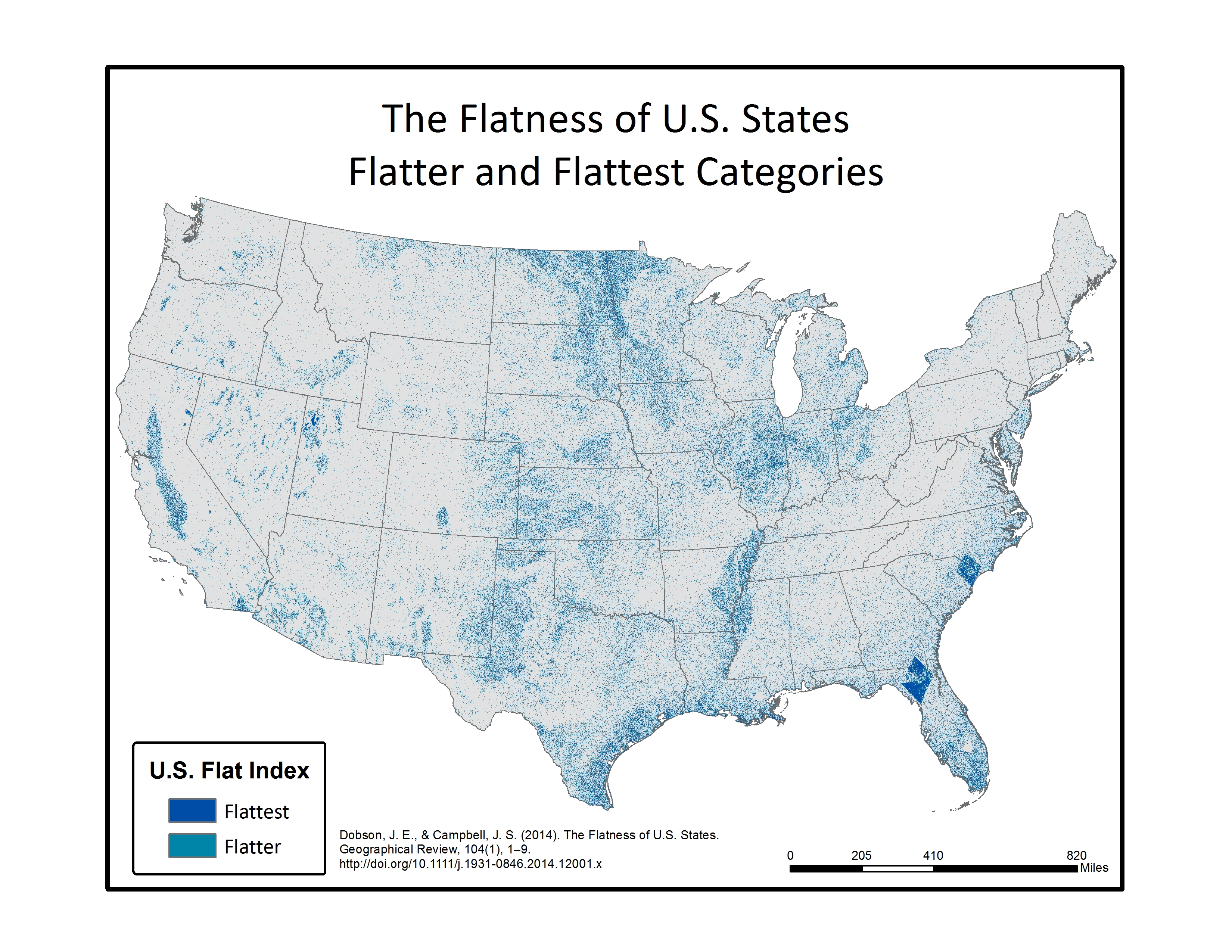
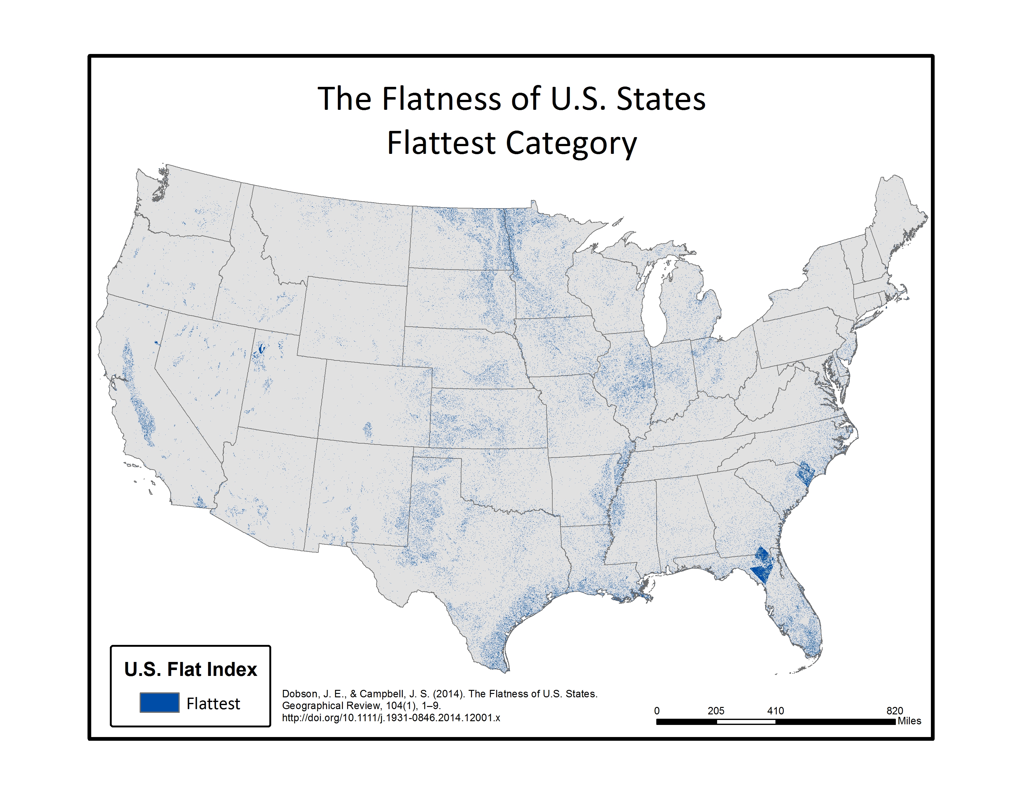
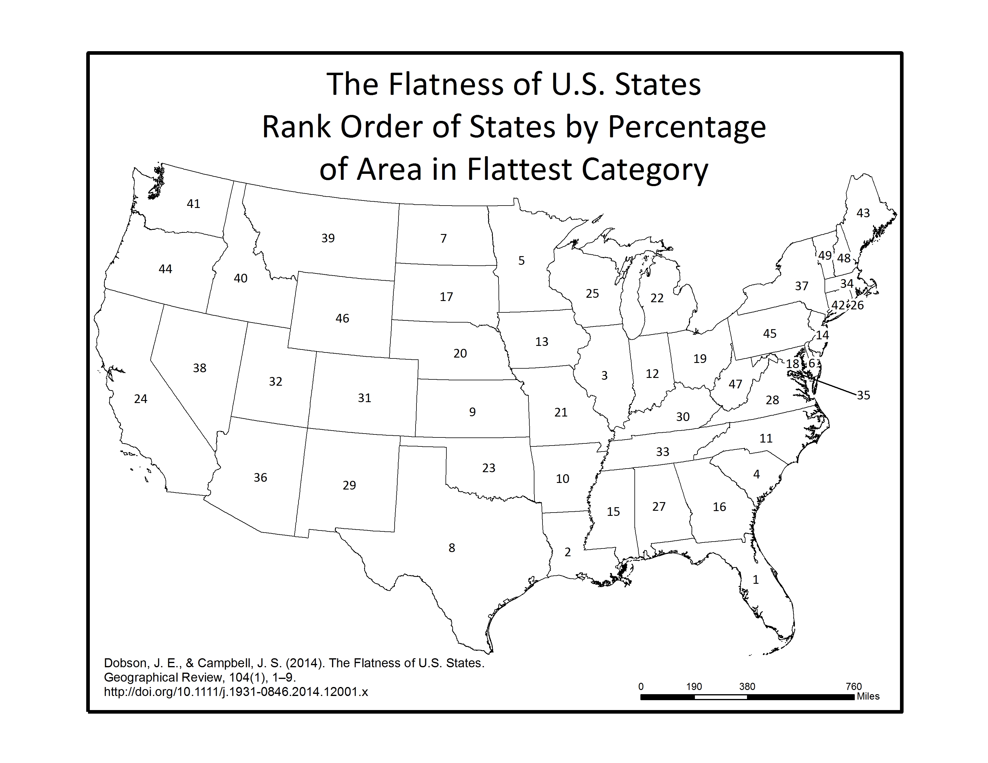
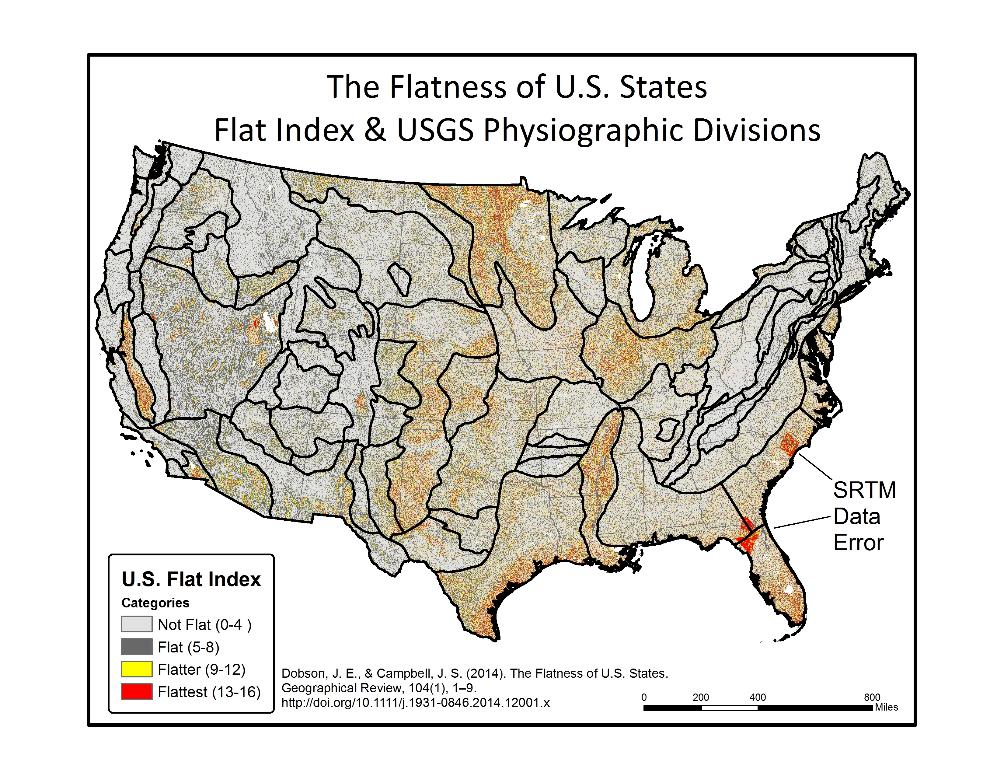
In the final step, each of the 16 individual azimuth scores were added together (r.mapcalc) to create a single index score ranging from 0-16 (0 being non-flat in all directions, 16 being flat in all directions). This index score was divided into four groupings, with Not Flat (0-4), Flat (5-8), Flatter (9-12), Flattest (13-16) categories. Zonal statistics (r.statistics) for each state were extracted from the final flat index, also known as the “Flat Map”, to calculate the rankings for flattest state. A water bodies data layer was used as a mask in the zonal statistics (r.mask) so as to eliminate the impact of flat surface water elevations (reservoirs and lakes) from the final calculation. A second mask was also used to eliminate the influence of two areas of bad data located in the southeastern U.S., mainly in Florida and South Carolina. Both total number of flat pixels and percent area flat pixels were calculated and ranked for the flat, flatter, and flattest categories. See the article below for a table of results.
Results
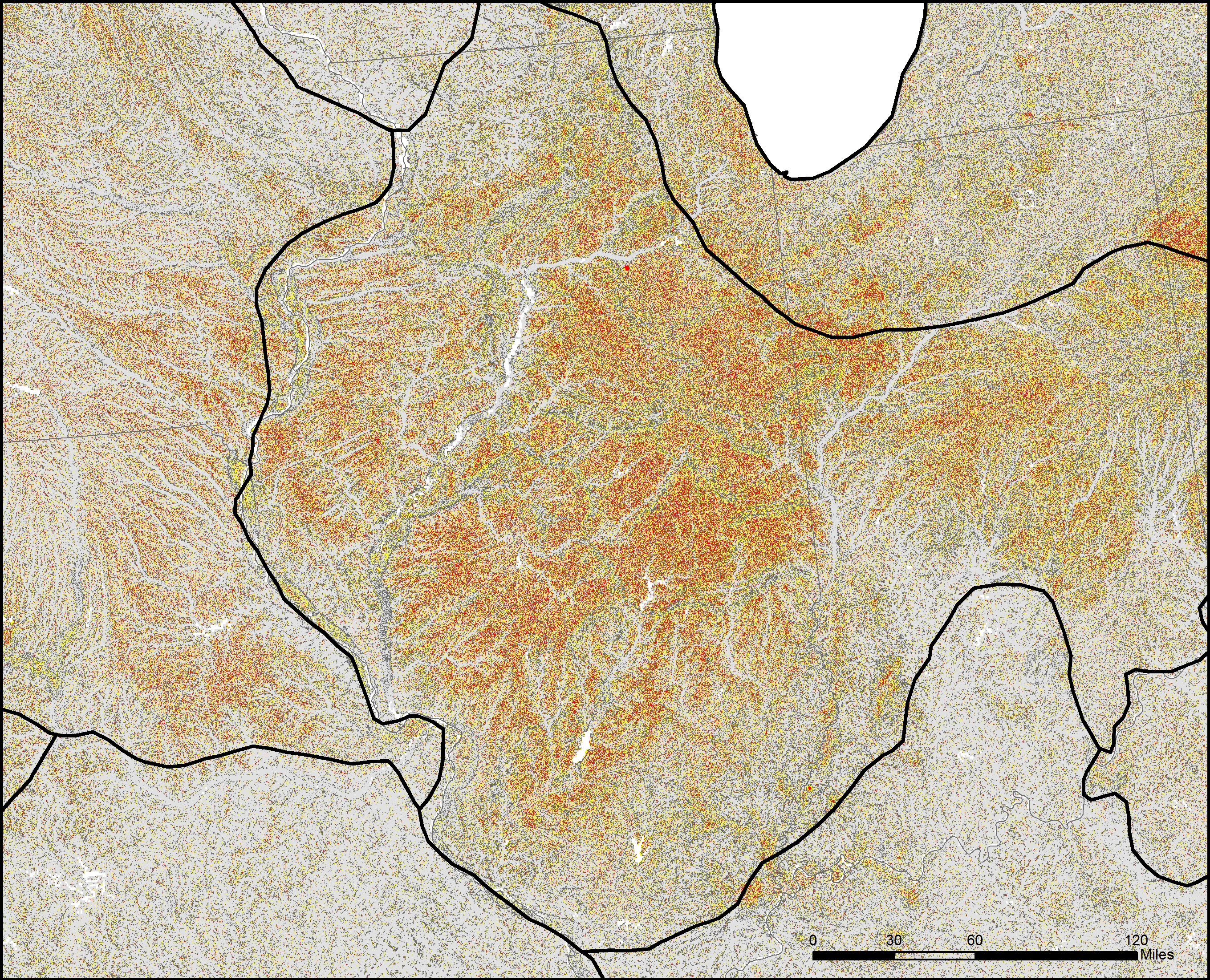
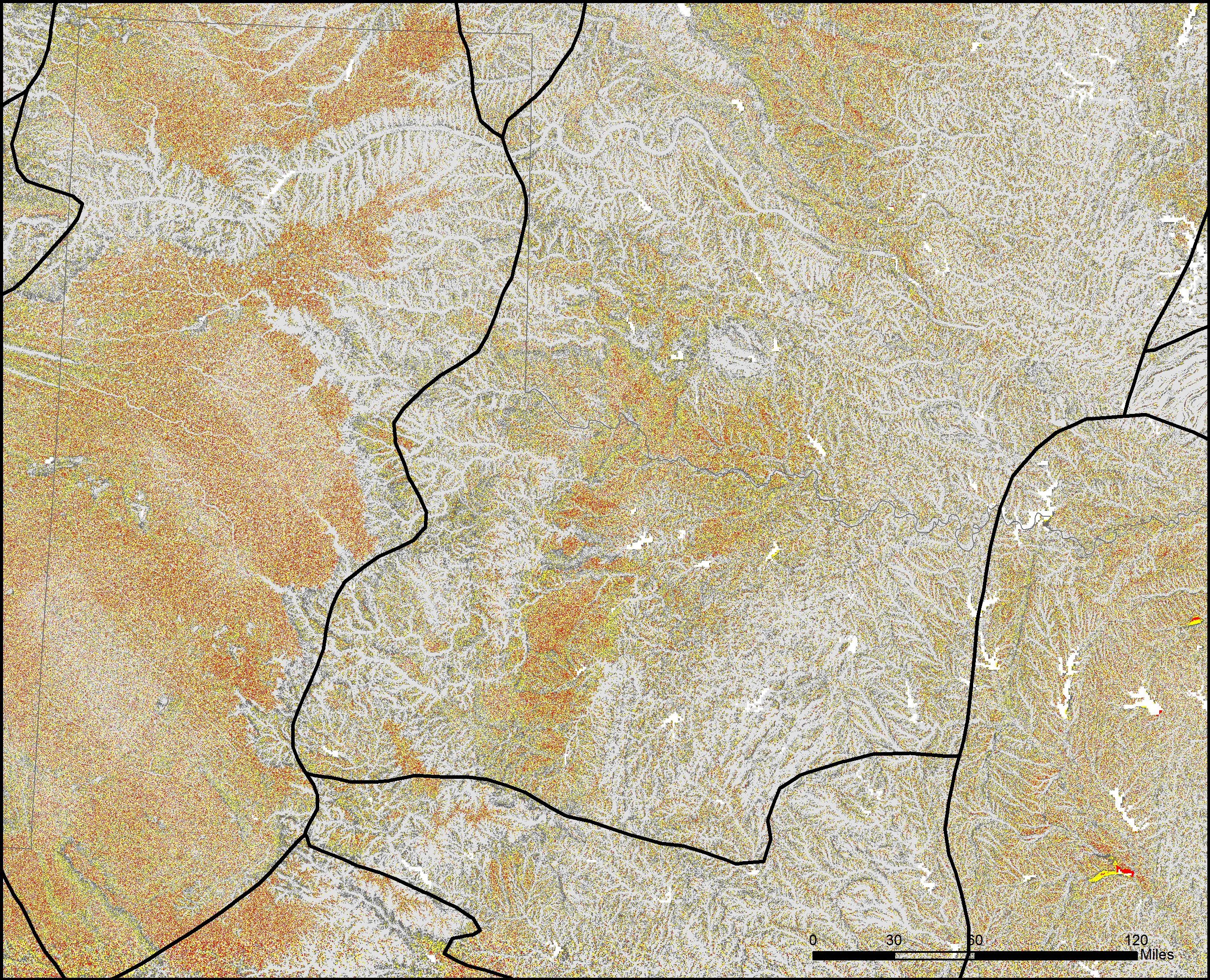
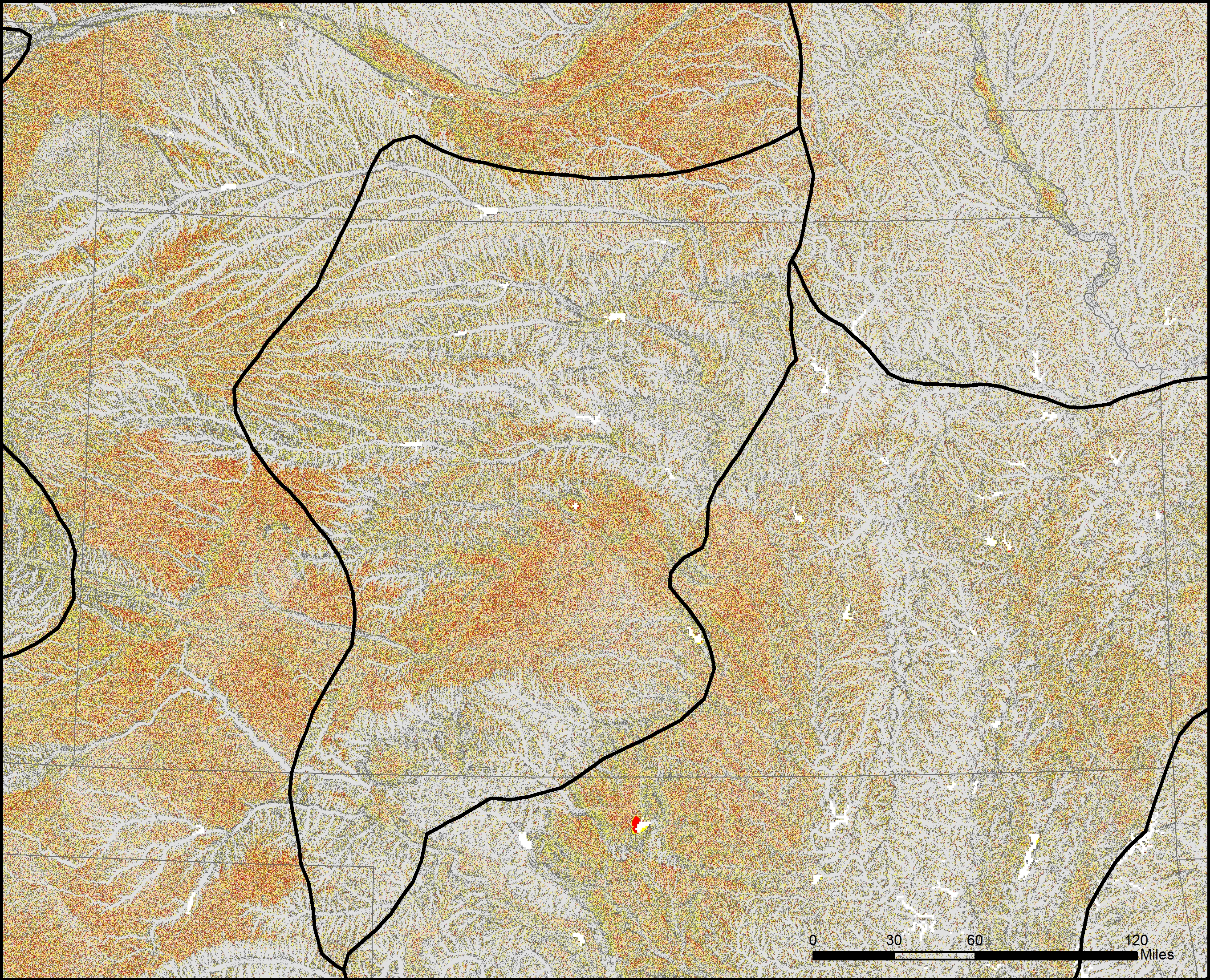
Below are a series of maps that display the final Flat Index. The spatial distribution of flat areas is intriguing, with some confirmations and surprises to our initial hypotheses. Interesting areas include the Piedmont and coastal plains of the eastern coastal states, Florida and the coastal areas of the Gulf States, the Red River Valley in Minnesota and North Dakota, the glacial outwash in Illinois and Indiana, the Lower Mississippi River valley, the High Plains region of the Great Plains, the Basin and Range country of the Intermontain West, and the Central Valley of California. A complete table of the state rankings is available in the article, and there are several more zoomed in maps available below. Each image is clickable and will open a much larger version.
Map shows the Flat Index, a.k.a the “Flat Map”, for the Lower 48 of the United States.Map displays the Flatter and Flattest Categories of the Flat Index. Useful for visualizing the patterns of flat lands within the continental United States.Map displays the Flattest Category of the Flat Index. These are the areas that can be called “flat as a pancake.”Rank order of States by the percentage of their area in the Flattest class. As initially thought, Kansas isn’t even close to the flattest.
Media
The media response to what Jerry Dobson, my coauthor and PhD advisor, and I refer to as the “Flat Map” took me by surprise. Jerry was always confident it would be well received, but the range of international, national, and regional coverage it received was beyond anything I imagined…and it keeps going.
As an added bonus, in the spring of 2017 renowned science blogger Vsauce featured the Flat Map in the a video about “How Much of the Earth Can You See at Once” (see video below). With over 4.5M views so far, this has to be most coverage the Flat Map has received. I recommend the entire video, and the Flat Map section begins around the 10:30 mark.
And this little gem from the 2015 Kansas Official Travel Guide…that’s right, the Flat Map made the Tourism Guide. In the very chippy AIR response to the Flat Map, the AIR editors indicate they got a call from the Kansas Director of Tourism. I’ll take this.
Does the perception of flatness impact tourism? Seems the State of Kansas is interested in projecting that the Kansas landscape has hills.
More Maps
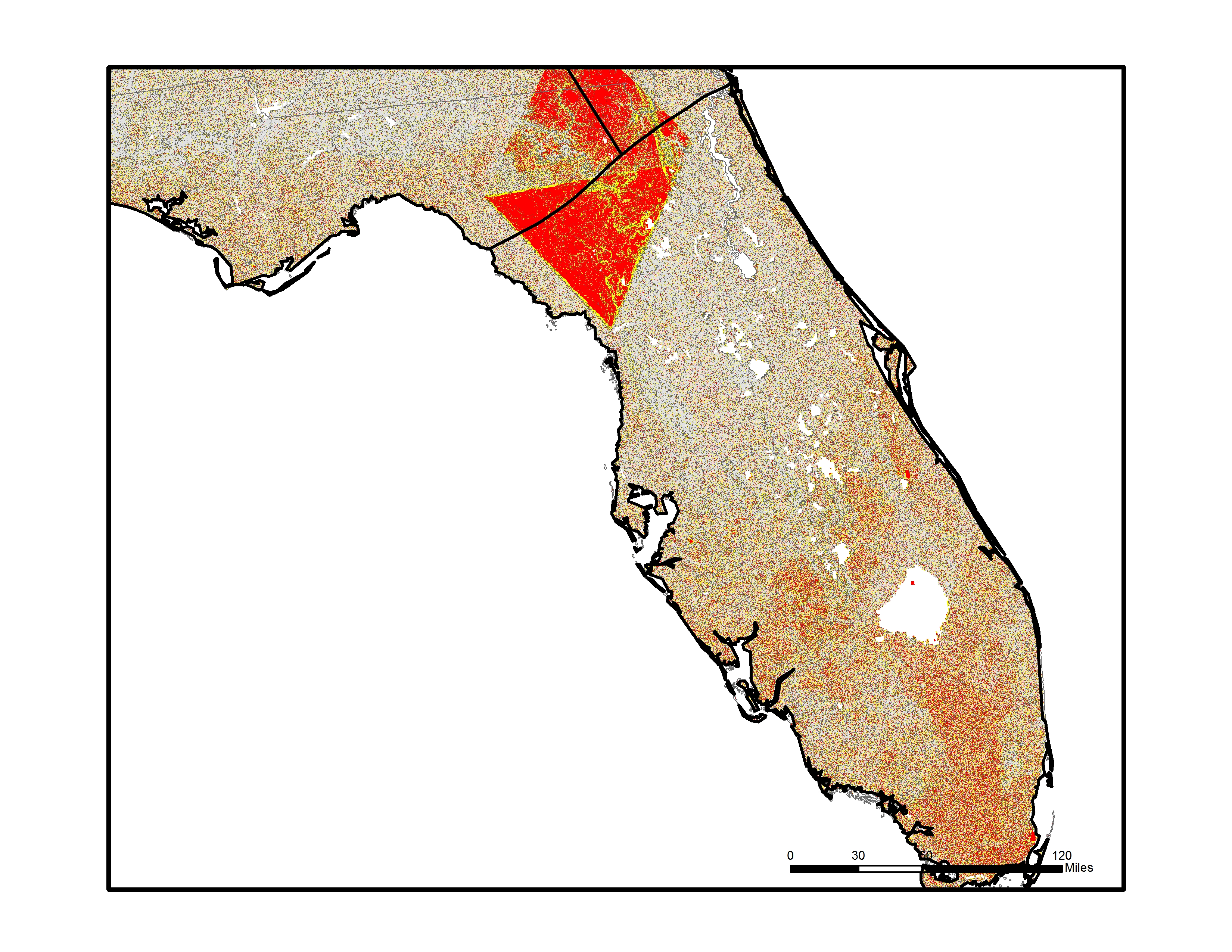
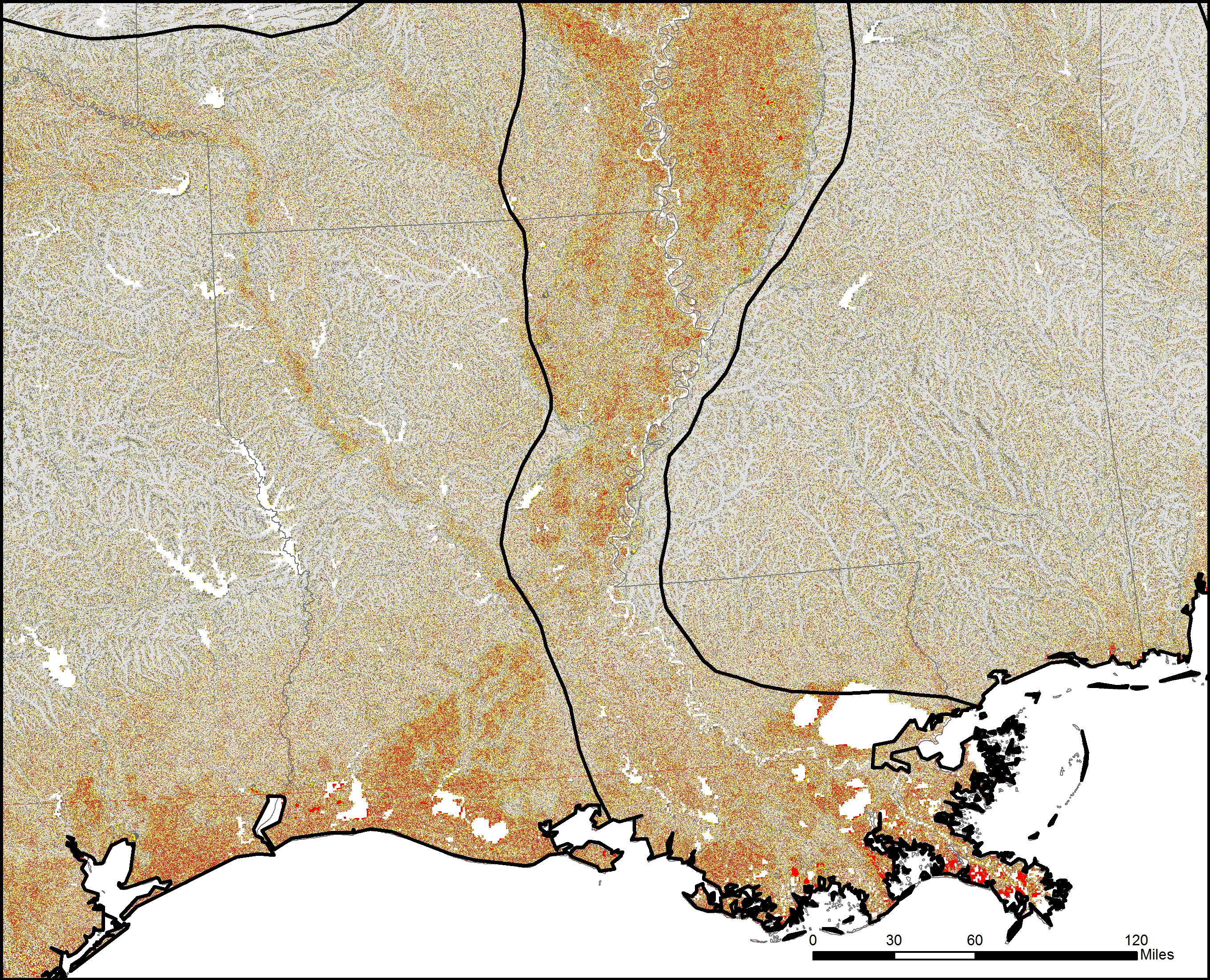
Map shows the Flat Index for the Lower 48 of the United States overlaid with the boundaries of the USGS Physiographic regions. Interesting correlation between flat areas and physiographic boundaries.Map displays the Flat Index over Florida, note large areas of flat land in southern half of the state and along the panhandle coast.Map shows the Flat Index over Louisiana and the Lower Mississippi Valley. Large areas of flat lands occur within the river valley and along the coastal areas.Map shows the Flat Index over Illinois and Indiana. Note the huge area of Illinois within the Flattest class, the result of glacial outwash geomorphic processes.Map shows the Flat Index over northern Texas and Oklahoma. Note large tracts of flat land in the western High Plains region.Map shows the Flat Index over Kansas. Note large areas of flat land in the western High Plains region and in the central area of the state corresponding to the Arkansas River valley and McPherson-Wellington Lowlands physiographic province.
Thanks
I would like to thank Dr. Jerry Dobson for his efforts on this paper. We worked together conceptualizing “flat” and how to build a novel, terrain-based, and repeatable method for measuring it. It was a long road to get the Flat Map out to the world, and Jerry was a constant source of inspiration and determination to get it published. When I was swamped with work at the State Department, Jerry pushed forward on the write up and talking with the media.
Future
In terms of the future, there is much more that can be done here. New distributed raster processing tools (Mr. Geo and GeoTrellis) could rapidly increase processing speeds, and provide an opportunity for using a more refined, multi-scalar approach to flatness. New global elevation datasets are also becoming available, and could potentially reduce the error of the analysis through lower margins of error in forested areas. If I was to do it again, the USGS National Elevation Datasets, particularly at the 30 meter and even 10 meter resolution, would be a great option for the United States. On the perception front, the terrain analysis results could be compared with landcover data to determine how landcover affects perception. Social media polling could also gather a huge amount of place-based data on “Is your location flat?” and “Is your location boring?”. I would also like to get the data hosted on web mapping server somewhere, so people could interact with it directly. A tiled map service and the new Cesium viewer would be a great tool for exploring the data. If anyone is interested in working together, let me know.
Article
Below is a pre-publication version of the article submitted to Geographical Review. Please cite the published version for any academic works.
Adding to the collection of amazing OpenStreetMap animations, the folks at Scout worked with the Ito World team to create a new addition to the “Year in Edits” series. Celebrating the 10 year anniversary of OpenStreetMap, the new video looks at the growth in OSM between 2004 to 2014 . As I’ve blogged before, I love these videos. The production quality is high, music is great, and they provide an easy way to communicate how amazing the OSM database has become. Kudos to all the volunteer mappers out there.
The purpose of this post is to simply collect in one place some of the amazing animations ITO World has produced from the OpenStreetMap database. I am often searching around on Vimeo to find them, so I thought it might be useful to put them here, especially as several new ones have been recently released. These visualizations come across as very professional, they have a high production value and include a good soundtrack. I don’t personally know any of the folks at Ito World, but would love to know what software they use to produce the animations.
The one I still find the most amazing is the animation depicting the Haiti Earthquake response. I often use this animation to help explain the value of OpenStreetMap and the volunteer mapping community in a disaster response situation. The ‘Imagery to the Crowd‘ concept is a direct result of the Haiti response.