Here is my ignite talk on the “Imagery to the Crowd” project from the International Conference on Crisis Mapping (ICCM 2012). I’ve attended each of the four ICCM conferences (Cleveland, Boston, Geneva, Washington DC). They have been a great way to understand the organizations that comprise the humanitarian community, and more importantly, meet the individuals who power those organizations. It was exciting to present on our work at the HIU, and contribute back to the Crisis Mapping community.
All of the Ignite talk videos are available at the Crisis Mappers Website(lineup .pdf) and collectively they represent a solid cross-section of the field. At the macro-level, I believe the story continues to be about the integration of these new tools and methodologies into established humanitarian practices. The toolkits are stabilizing (crowdsourcing, structured data collection using SMS, volunteer networks, open geographic data and mapping, social media data mining) and are being adopted by the major humanitarian organizations. While I am partial towards crowdsource mapping, the Digital Humanitarian Network and the UN OCHA Humanitarian eXchange Language (HXL) are two other exciting projects.
We have been busy reviewing the results of the Camp Roberts / Relief 12-3 mapping experiment for the Horn of Africa. In this phase of the project,the OpenStreetMap (OSM) community was provided short-term access to high resolution commercial satellite imagery over two large collections of refugee camps in Ethiopia (Dollo Ado) and Kenya (Dadaab). The goal was to map the roads and footpaths in 10 refugee camps, that contain a population over 600,000 people, in 48 hours. A more detailed numerical analysis of the data will follow, but from a qualitative perspective the results are amazing. Below are examples taken from one specific camp, the Bokolmanyo camp in Ethiopia, and links to each of the 10 camps mapped in the experiment.
Bokolmanyo refugee camp in the OSM database on 20 May 2012Bokolmanyo refugee camp in the OSM database on 28 May 2012
The ‘Dollo Ado’ refugee camp in Ethiopia is actually composed of 5 individual camps. These camps literally did not exist in OSM before the experiment began. The latest population estimates for the camps report that in total there are 151,972 individuals / 36,721 households living in the Dollo Ado camps (from the UNHCR data portal for the Horn of Africa, and specifically the 22 May 2012 Dollo Ado population statistical report).
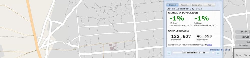
Similarly, the ‘Dadaab’ camp in Kenya is also composed 5 individual camps with a total of 465,334 individuals living there (UNHCR 20 May 2012 Dadaab population statistical report). These camps have been in operation longer than Dollo Ado, and contains 3 times more people. At the beginning of the experiment 3 of these camps had some map data in OSM, however the newer Ifo 2 and Kambioos camps were non-existent. All camps had significant improvements.
These impressive results are due to the hard work of a wide range of people, and I would like to thank several of them: first is the OSM volunteers who donated their time and energy to mapping these camps – you literally helped put 600,000 people on the map; the HIU technology team who went above and beyond in getting the tech stack running; the State Department, Office of the Geographer (Lee Schwartz and Benson Wilder) – USAID Office of Foreign Disaster Assistance (Chad Blevins) – USG partners (Katie Baucom and Nat Woolpert) who were key to keeping the process moving; John Crowley for providing constant energy and opening the Camp Roberts venue as a place to work; Kate Chapman and Schuyler Earl from the Humanitarian OpenStreetMap Team for advising on the process and making modifications to the tasking server to accommodate NextView; the UN’s Operational Satellite Applications Programme (UNOSAT) for its early help with image processing and serving.
Let’s hope this is just the beginning. I’ll be posting the results of the numerical analysis here, as well as details on the actual request workflow and technological implementation.
Today I gave a guest lecture to the Prof. Stephen Egbert and Prof. Shannon O’Lear ‘s ‘Geography and Genocide’ class (Geography 571) at the University of Kansas. Students in this class come from a range of backgrounds, so the content was designed as an introduction to GIScience and it’s potential applications. This included a brief review of GIS 2.0 concepts, and moved on to show how these tools are being utilized in humanitarian applications.
It is always interesting to introduce people to these technologies. The Open Street Map – Project Haiti video just blows people away. I like to show it first as an indication of what GIS 2.0 is all about — open source GIS software combined with inexpensive, powerful hardware is allowing people to interact, produce, and consume geographic data in amazing ways. Back this up with a review of Ushahidi-Haiti, the role of Twitter in Iran, and the utility of virtual globes loaded with high-resolution satellite imagery in Darfur, and you see the lights go on.
This lecture also gave me the opportunity to review some the KML datasets I have been working on for the Humanitarian Information Unit regarding Darfur and DRC. While there is nothing earth-shattering about mapping point data in KML, utilizing the time component and animation capability in Google Earth does begin to translate a dataset into a story (or geo-narrative as Madden and Ross call it). I’ll make these available as soon as possible.
")
")