“We started from the bottom now we here…” -Drake
A recent article on the most remote places in America struck a cord with me. The article, published by the Washington Post, utilizes recent work on global travel times that models the transportation networks between any two places on earth, using a range of transportation options. This work, A global map of travel time to cities to assess inequalities in accessibility in 2015, is a tremendous achievement of spatial data aggregation, topological connectivity, and spatial modeling, and is worthy of a post in and of itself.
That said, it was the work done by the Post , using the Global travel time data to determine remote places in the United States that caught my attention. In looking at the map (Figure 1 below), it takes a second to understand what is being modeled. The details are spelled out quite clearly in the article, but of course, I looked through the map first.
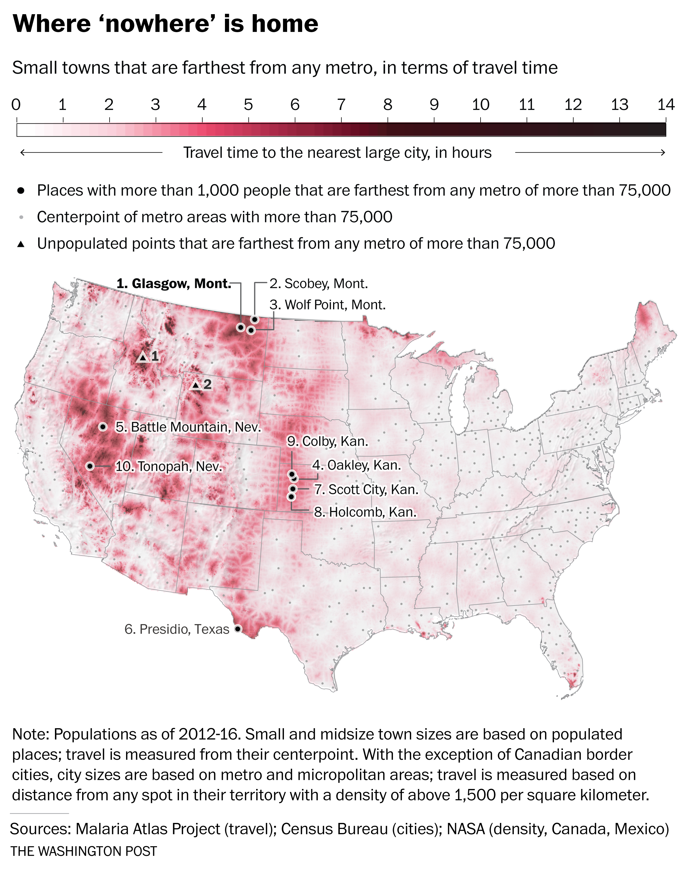
When you think of “remote”-ness, the first thing the comes to mind is a desolate mountain cabin or desert camp. And the map above does highlight the two places with the longest travel times in the Lower 48. However, this is an absolute value of remoteness, a one way path. The more interesting component of this analysis is the comparative definition of remote…where the travel time between two actual locations is calculated. The desolate mountain cabin is the domain of a single person…what does it mean to be remote when you live in an actual town?
In this analysis, the travel time between every location in the Lower 48 U.S. and the nearest metropolitan area (city with a population greater than 75,000) is derived from the Global travel data. This creates a continuous surface where every 1,000m x 1,000m grid cell contains a travel time. When mapped, this data forms a type of “travel-shed” map that is reminiscent of hydrologic and watershed maps. Commensurately, the boundaries of the travelsheds are the areas with the largest travel times, and help delineate regional zones where a particular city is dominant. The travel speed of various transport modes are also reflected in the data, e.g., interstates are faster than secondary highways, and that fact imprints a pattern where the fastest paths resemble river valleys in the travelsheds. Finally, the ridges between travelsheds provides the “remote” areas, farthest away from population centers.
From a macro perspective, the highly populated eastern U.S. shows much lower variation in travel times when compared with the more sparsely populated areas of the Great Plains, Rocky Mountains, and intermontane areas of the western states. This is a combination of higher overall population and a fairly even distribution of populated places…essentially there are so many people that it’s hard to get too far from a larger town. Notable areas of high travel times include the intermontane areas of Utah and Nevada, the Trans-Pecos region of West Texas, and an interesting ridge through the mid continent that roughly follows the western extent of the High Plains physiographic region.
In the next step of the analysis, the travel time layer is intersected with the location of all American cities greater than 1,000 people, and the travel time between the small city and the nearest city of 75,000 people was calculated. Brilliant. In fact, they did the same analysis comparing towns with population larger than 1,000, 5,000, and 25,000. The ranked list of cities is displayed in Figure 2 below.
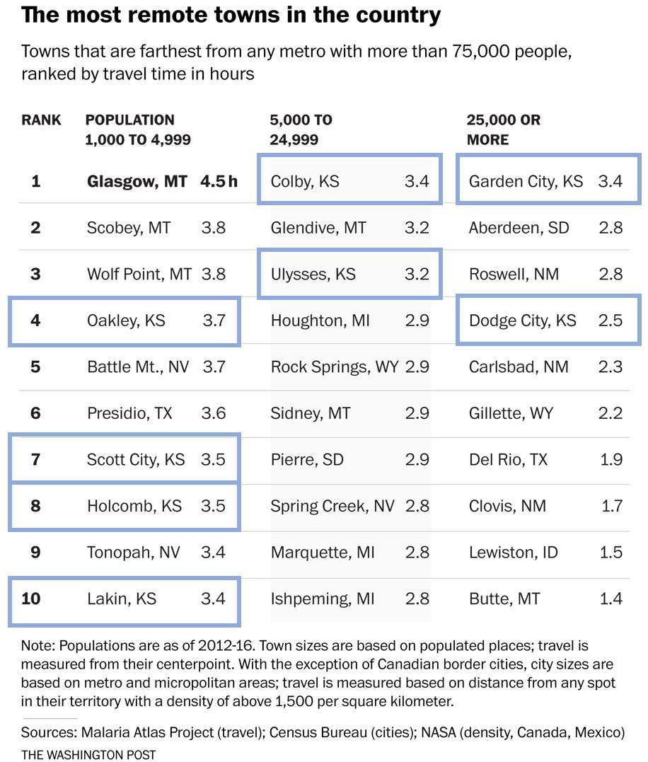
So why is this significant to me? Beyond being a super slick GIS application, two other reasons. First, I grew up in southwest Kansas, an area that I have often described to people as being about as far away from anything as you can get in this country…and it turns out, I was right. My hometown is #10 on the list…and four other locations in the top 10 of the small towns list are its neighbors. Additionally, other towns in southwest Kansas top the most remote in the mid- and large- town lists. The longitudinal ridge of “remoteness” that extends along the 107 degree west longitude line seems to be a “travel-shed” boundary between the populated places of the Colorado Front Range and those in eastern Kansas.
The second interesting element of this analysis is how it compares to my previous work on “flatness”. I haven’t done any quantitative work on this, but a visual comparison of the two maps seems to show a bimodal distribution of remote places…they are either very flat or very not flat. Conjecture could lead one to intuit that flat places are remote because they may be uninteresting to live, while not flat place are remote because it is difficult to get to them.
But I think that is simplistic, the flat remote places are instead driven by the economic geography of the region. For southwest Kansas, that means an economy dominated by agriculture…a lifeway that increasingly requires less and less people, but that still demands population centers at regular intervals to efficiently collect and transport the harvests. This leads to the mix of low population, that is regularly dispersed, and occupies flat terrain. Compare this to the remote area of central Nebraska, which is also on the 107 degree meridian, but that doesn’t appear in this list because there are no settlements that exceed 1,000 people. The Sand Hills mean there is no agriculture, no economic lifeway that requires any substantial grouping of people.
In conclusion, this list of towns reads like a schedule of summer swim meets from my youth…and it’s just bizarre to see it spelled out in a national newspaper. These places that I know well, that I spent significant parts of my life studying the archaeological and climatic past of…are in fact, some of the most remote, yet connected, places in the United States. And now having spent almost 10 years in DC, I’ve come to appreciate just how far the cultural distance is between these remote outposts and the populated centers of the coastal U.S.
The human geographies that occupy these urban / rural divides is tremendous, and there is no clear path between them. Communication technology has shrunk these distances, whether it be the satellite dishes that were prevalent in my youth, or the internet now, technology has homogenized the cultural experience to a large degree…overcoming the limitations of spatial distance. But these areas do feel “remote”, they are a long way, both in culture and travel distance, from the economic and cultural engines of our society.
It is interesting that the original goal of the global travel time data was to assess the inequalities that become manifest when the accessibility to cities is limited. The value of this data for the Sustainable Development Goals (SDG) is clear, and I think will be used in a myriad of ways to plan and contextualize international development efforts. But what does it mean for our society, what does being remote inside the United States mean? What inequalities will become manifest for our own citizens as accessibility to cities remains limited? Maybe this map should be used for some domestic sustainable development?
And while it was the personal connection to my life that drew me to this work, it is clear the data and methodology presented here do offer an valuable framework for understanding the implications of population distribution. In the SDG context, the use of these spatial tools will positively impact development planning and execution, and the team who compiled this data should be applauded. The geospatial revolution continues…