Dream Team and the Rise of Geographers

Dream Team
 Image links to original article.

Back in September, the team at Government Executive did a fantasy football – inspired take on government leadership. Entitled the Dream Team, the short piece highlights eight bureaucrats found throughout the government (or formerly in the government in my case).  To use the words of the GovExec authors, “here are some of the folks we’d love to see on any leadership team tackling the kinds of big problems only government can address.

Collectively, this group has a range of skills: finance, acquisitions, program and project management, legal, IT security, HR, software platform development, disaster recovery…and somewhat curiously, two geographers.

I’m humbled to have been included on this list, particularly given the accomplishments of the other geographer, Mike Byrne.  That said, what I find more intriguing is how two geographers made this list to begin with. What is it about geography that is gaining the attention of management and leadership journalists? Why would they think these are the skills needed on government teams to solve big problems? And why now?

Starting with the question of awareness, its clear that digital geography and maps have captured the public’s attention. The combination of freely available Global Positioning System (GPS), ubiquitous data networks, high resolution imagery, increasingly powerful mobile devices, and interoperable web services has fundamentally changed how the average person interacts with maps and geographic data. In the ten years since the introduction of Google Earth, the expectation of the average person is now to have complex, updated, descriptive, interactive maps at their disposal anytime, anywhere, and on any device. This shift is nothing short of revolutionary.

And while the glitz of slippy maps and spinning globes has brought the public back to maps, there is more to the story of why geographers are critical elements of multidisciplinary leadership teams.  I believe there are two key characteristics that set geographers apart: Information Integration and Problem Solving. The first is the the capacity of the spatial dimension to integrate information across disciplines, and the second is how spatial logic combined with digital tools can predict, analyze, and visualize the impact of a policy decision.

Begin TL;DR

Let’s begin with the idea of information integration. At its core, Geography is a spatial science that utilizes a range of qualitative, descriptive, quantitative, technical, and analytical approaches in applications that cross the physical sciences, social sciences, and humanities.  It may seem trite to say, but everything happens somewhere, so anything that involves location can be studied from a geographic perspective.  Where most disciplines have fairly defined domains of knowledge, Geography, and its focus on the spatial dimension, cuts laterally across these domains.

The cross cutting nature of location is the fundamental reason why Geography is in a resurgence.  Geographic location provides the mechanism to integrate disparate streams of information. Data that relates to one discipline can be linked to other data simply by its location. As a conceptual framework, Geography is an integrative lens, i.e., what are the forces that interact to define the characteristics of this location, and when combined with Geographic Information Systems (GIS) technology, spatial location acts as the relational key used to link tables of information together in a database.  It is this union of mental framework and technology that provides Geography a unique capacity for information integration.

However, information is typically aggregated for a purpose, the goal is to solve a problem, find an answer, understand a situation, and Geography offers unique tools for that as well.  All problem solving is about breaking a complex problem into divisible, solvable units. For a geographer this starts with the application of spatial logic to the problem; this means when solving a multivariate problem, a geographer will accept the spatial distribution and spatial associations of a phenomenon as primary evidence, and then seek to discover the processes that led to that distribution. This contrasts most disciplines, where process based knowledge on individual characteristics are combined, then tested against the spatial distribution .  The elevation of spatial logic over process logic is the key differentiator between a geographer and a domain-specific analyst.

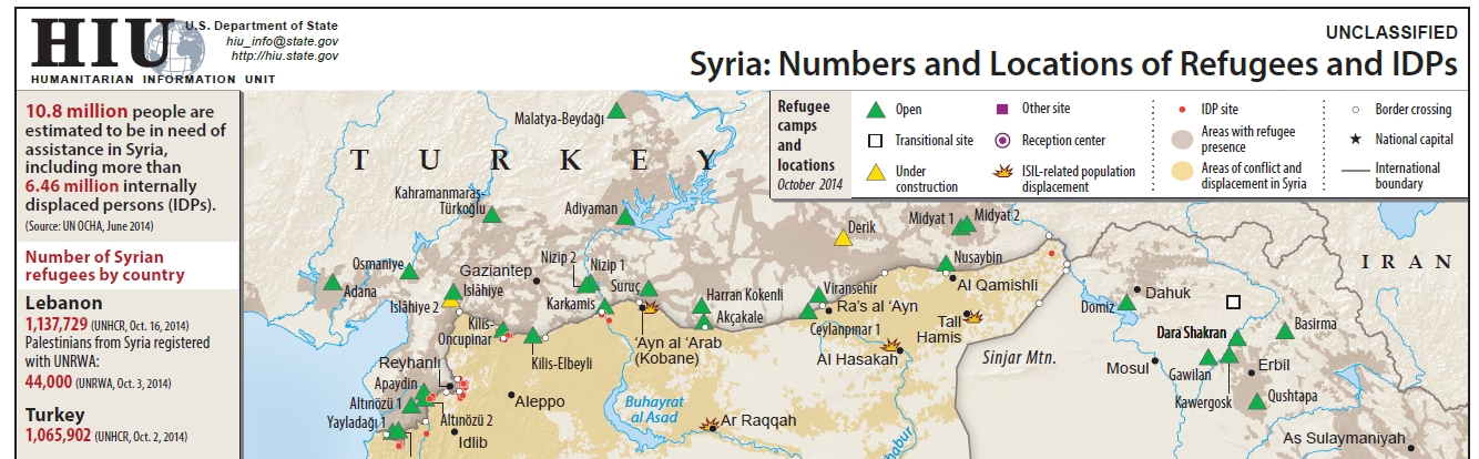
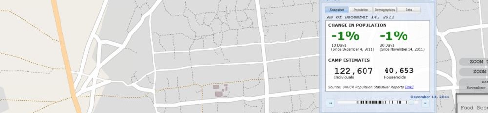
Bringing spatial logic into the technological domain relies upon Geographic Information Science (GISc) to provide the conceptual framework, algorithms, and specialized tools needed to analyze data encoded with location information.  It is the analytical power of these functions, integrated with the data collection, storage, retrieval and dissemination tools of GIS, that form the toolkit for problem solving used by geographers.  Additionally, cartographic visualization provides a mechanism to encode these data and analysis so that complex spatio-temporal relationships can be displayed and quickly understood.  Whether it is data exploration, sense making, or communicating results, displaying geographic data in map form is a tremendous advantage over text.  And now with the web, cartography can be interactive, cross-multiple scales, and be dynamic through time.

So, why is now the time for geographers?  The answer is threefold, first it has to do with the scale and complexity of problems we are facing, second is the amount and variety of information that can be applied to the problems, and third is the maturity of the digital geographic tools. Finding solutions to deal with climate change, energy, sustainable development, disaster risk reduction, and national security will require interdisciplinary approaches that are firmly grounded in the spatial dimension.  With the transition to a digital world, society (governments included) finds itself in a state of information overload. In this world where data is plentiful, value shifts from acquiring data to understanding it. Geography as a discipline, and geographers equipped with a new generation of spatial information technology, are well adapted to this new paradigm.

If done correctly, the modern geographer has broad academic training across a range of disciplines, uses the spatial perspective as a means of information integration and analysis, and is facile with the digital tools needed to collect, store, analyze, visualize, and disseminate geographic information and analysis.  Combine these skills with management and leadership training, and the geographer becomes a portent fusion.  One that I think this article correctly identifies as critical to the leadership teams needed to solve big problems.

Here they come to save the day...
Here they come to save the day…
Dobson, J. E. (1992). Spatial Logic in Paleogeography and the Explanation of Continental Drift. Annals of the Association of American Geographers, 82, 187–206.
Print Friendly, PDF & Email

A decade of OpenStreetMap, beautifully visualized

Adding to the collection of amazing OpenStreetMap animations, the folks at Scout worked with the Ito World team to create a new addition to the “Year in Edits” series. Celebrating the 10 year anniversary of OpenStreetMap, the new video looks at the growth in OSM between 2004 to 2014 . As I’ve blogged before, I love these videos. The production quality is high, music is great, and they provide an easy way to communicate how amazing the OSM database has become.  Kudos to all the volunteer mappers out there.


Print Friendly, PDF & Email

2013 Bold Award and Thoughts on Government Innovation

NextGov Bold Award 2013
Bold Award 2013, awarded for the Imagery to the Crowd initiative

In 2013, the NextGov media organization began the Bold Award, given for innovation in Federal technology. It is an interesting award, as the idea of innovation in the government is usually the punchline of a bad joke.  But the folks at NextGov are on to something, as innovation in the government is actually really difficult. Besides the usual set of restrictions (a stodgy, risk-adverse bureaucracy, broken acquisition processes, and woefully dated information systems), one of the challenges is measuring the impact of an innovation.

In the private sector, a financial metric like Return on Investment (ROI) is a visceral and quantifiable measure of success.  Usually a product is built to fill a gap identified in the market. In order to manage the risk of launching a new product, a protoype is built, beta tested, feedback from the market incorporated, and a revised prototype is built. Wash-Rinse-Repeat till the product makes money, or the underlying assumptions are proven wrong and development stops.

For several reasons the notion that an innovation could be proposed, implemented, measured, iterated, and the team rewarded for success does not translate to government.  First, success is difficult to quantify, let alone tie back to specific actions.  In the context of the HIU, what is the value of informing a policy maker better? How do you measure a good decision? How do you know its a good decision when you can’t know the alternative?  When trying to build something like Imagery to the Crowd or the CyberGIS, how can I measure the impact on foreign policy?  When a decision is ultimately made, it was on the basis of multiple streams of information, how do you determine the value of a single product?  This situation is not unique to government, but the government does introduce some unique dynamics.

Second, there is no incentive to reduce cost. A culture of “we have money at the end of the year” means dollars get spent by years end, often regardless of utility. So if you actually save money, the bureaucracy figures you can do your mission for less and cuts your budget. This is a sentiment that is counter-intuitive at best, criminal at worst.

Third, the broken acquisition systems means that there is no way to fund an agile approach to product development in the government.  Implementations of “minimal viable product” and rapid prototypes are a rare occurrence in the government.  Instead, innovation must follow a procurement process where the innovator has to determine “requirements” (a mind-numbing process), put it out to bid (a mind-numbing process), idea awarded to low ball estimator, it gets built (maybe correctly), and two fiscal years after you started, you have some implementation of your innovative idea (that you have to pay extraordinary costs to the original contractor to change).  Not a recipe for success.

We know government bureaucrats work for the citizens (something I was proud to do), and that they have a duty to reduce costs and increase the quality of services delivered to/for citizens. However, the system is broken when the momentum behind keeping the status quo in place massively overwhelms the need for change.  So what exactly is the motivation for a government employee to be innovative? We know its not money, as innovators are worth significantly more in the private sector. From my experience it comes down to the fact that people care. Yeah, not usually a thought that people use to describe government bureaucrats, but it’s true. There is a tremendous amount of talent and willingness to work hard in the government workforce. The problem is they are shackled, and the cost to be innovative is a personal willingness to put themselves at risk and continually run through bureaucratic walls. As documented by the Washington Post lately, the government is losing the next generation of leaders because of this nonsense.

So back to the idea of awarding innovation in Federal technology. As part of the NextGov inaugural class, I was nominated and awarded a 2013 Bold Award for the Imagery to the Crowd initiative. This was an honor to win, but also disingenuous in that it would not have happened without a crew of people. Those folks at the HIU and elsewhere know who they are and the key role they played.  Gratitude. #oMC.

The 2014 Bold Award winners are listed here

Print Friendly, PDF & Email

Why Maps Matter

Back in March 2014, FCW published two articles written by Frank Konkel that mentioned the HIU’s work with digital mapping. The first, entitled “Why Maps Matter“, is a good summary piece that reviews how geographic technology is used in various U.S. government agencies. The key points are the growing recognition in the government that visualization is a powerful tool for policy making, and how new companies are making it significantly easier for new users to leverage geographic technology. Beyond discussing the HIU, case studies from the Federal Communications Commission (FCC), Capitol Hill, National Park Service (NPS), and the National Geospatial-Intelligence Agency (NGA) are mentioned.

The second article, State Department: Mapping the humanitarian crisis in Syria, is a shorter piece that focuses solely on the HIU and its work in mapping the Syria humanitarian crisis. Having worked closely on Syria for two years, I can say we put a tremendous amount of effort into building comprehensive refugee datasets, verifying data from news reports, NGO reports, and commercial satellite imagery. Additionally we built inter-agency compatible data schema that leveraged geographic locations and P-Codes for information integration (P-Code dataset, P-Code Viewer). And to visualize it all, we built custom web mapping applications with tools to interactively explore all of the data across time and space.  A significant portion of the HIU work on Syria (and now Iraq) is available on the HIU Middle East Products page, additionally, the data used for the Refugee and Internally Displaced Peoples layers are available for download on the HIU Data page.

It is clear the appreciation and value for geographical data, analysis, and visualization are on the rise; FCW lists the the Why Maps Matter article as the 3rd most popular of 2014. Fully recognizing the value of geography requires that the notion of maps as “pieces of paper” must be replaced with an appreciation and use of geographic data and spatial analysis as a tool of policy formation. This change is happening, albeit slower than I’d like, but its adoption will result in better, more agile policy, and benefit the government and citizens alike.

Clip of Syria map produced by the HIU, full map available here - https://hiu.state.gov/Products/Syria_DisplacementRefugees_2014Oct23_HIU_U1109.pdf
Clip of Syria map produced by the HIU, full map available here – https://hiu.state.gov/Products/Syria_DisplacementRefugees_2014Oct23_HIU_U1109.pdf
Print Friendly, PDF & Email

QGIS 2.0 Update // Install on Windows

In response to my previous post on the challenges of installing the new QGIS 2.0 version, I wanted to highlight a new post by the folks over at Digital Geography. Not only did they write a good post on the Ubuntu install of QGIS 2.0 (now updated with an install video), but they have followed up with a summary of the Windows install of QGIS 2.0.

I posted a comment about my concerns regarding the automatic installation of the SAGA and OTG dependencies, and Riccardo answered that the Windows install does include both. I haven’t tested it yet, but automatically including them would be great. Would appreciate if anyone could confirm this in the Windows install, and if the Ubuntu install has been updated.

Links:
https://www.disruptivegeo.com/2013/09/qgis-2-0-and-the-open-source-learning-curve/
http://www.digital-geography.com/
http://www.digital-geography.com/install-qgis-2-0-on-ubuntu/
http://www.digital-geography.com/installation-of-qgis-2-0-dufour-on-windows/

Print Friendly, PDF & Email

QGIS 2.0 and the Open Source Learning Curve

As likely everyone in the geo world knows by now, the widely awaited release of QGIS 2.0 was announced at FOSS4G this week. Having closely watched the development of QGIS 2.0 I was eager to get it installed and take a look at the new features. I am for the most part a Windows user, but I like to take the opportunity to work with the open source geo stack in a Linux environment. My Linux skills are better than a beginner, but because I don’t work with it on a daily basis, those skills are rusty. So I decided this is a good excuse to build out a new Ubuntu virtual machine, as I haven’t upgraded since 10.04.

Build Out The Virtual Machine

Let’s just say I was quickly faced with the challenges of getting Ubuntu 12.04 installed in VMware Workstation 7.1. Without getting into details, the new notions of “Easy Install” and its effect on installing VMware Tools took a while to figure out. In case anyone has the Easy Install problem, this YouTube video has the answer, also posted in code below:

sudo mv /etc/rc.local.backup /etc/rc.local
sudo mv /opt/vmware-tools-installer/lightdm.conf /etc/init
reboot the virtual machine

The second problem, about configuring VMware Tools with the correct headers, is tougher. I’m still not sure I fixed it, but given its rating on Ask Ubuntu, it’s obviously a problem people struggle with. Suffice it to say there is no way that I could have fixed this on my own, nor do I really have a good understanding of what was wrong, or what was done to fix it.

The Open Source Learning Curve

This leads me to the point with this post, open source is still really tricky to work with. The challenges in getting over the learning curve leads to two simultaneous feelings: one, absolute confusion at the problems that occur, and two, absolute amazement at the number of people who are smart enough to have figured them out and posted about it on forums to help the rest of us. While its clear the usability of open source is getting markedly better (even from my novice perspective), it still feels as if there is a “hazing” process that I hope can be overcome.

QGIS 2.0 Installation

With that in mind, here is some of what I discovered in my attempt to get QGIS 2.0 installed on the new Ubuntu 12.04 virtual machine. First, I followed the directions from the QGIS installation directions, but unfortunately I was getting errors in the Terminal related to the QGIS Public Key, and a second set on load. Then I discovered the Digital Geography blog post that had the same directions, plus a little magic command at the end (see below) that got rid of the on load errors.

sudo chown -R "your username" ~/.qgis2

After viewing a shapefile and briefly reviewing the new cartography tools, I wanted to look at the new analytical tools. But there was a problem, and they didn’t load correctly. So back to the Google, and after searching for a few minutes I found the Linfinty Blog on making Ubuntu 12.04 work with QGIS Sextante. After a few minutes downloading tools I check again, this time the image processing tools are working, but I keep getting a SAGA configuration error. After figuring out what SAGA GIS is, and reading the SAGA help page from the error dialog box, it was back to searching. The key this time was a GIS Stack Exchange post on configuring SAGA and GRASS in Sextante, this time the code snippet of glory is:

sudo ln -s /usr/lib64/saga /usr/lib/saga

Next, back to QGIS to fire up a SAGA powered processing routine, and the same error strikes again. More searching and reading, now its about differences in SAGA versions and what’s in Ubuntu repos. With no clear answer, I check the Processing options in which there is an “Options and Configuration”, which has a “Providers” section, which as an “Enable SAGA 2.0.8 Compatibility” option.  Upon selecting the option, boom, the all the Processing functions open. Mind you I haven’t checked whether they actually work, after several hours they now at least open.

"Processing" configuration options in QGIS 2.0
“Processing” configuration options in QGIS 2.0

Conclusion

It is clear that the evolution of open source geo took several steps forward in this last week, and the pieces are converging into what will be a true end-to-end, enterprise-grade, geographic toolkit. And while usability is improving, in my opinion, it is still the biggest weakness. Given the high switching costs for organizations and individuals to adopt and learn open source geo, the community must continue to drive down those costs. It is unfair to ask the individual developers who commit to these projects to fix the usability issues, as they are smart enough to work around them. Seems to me it is now up to the commercial users to dedicate resources to making the stack more usable.

Key Resources:
http://changelog.linfiniti.com/version/1/
http://www.youtube.com/watch?v=fmyRbxYyOmU
http://askubuntu.com/questions/40979/what-is-the-path-to-the-kernel-headers-so-i-can-install-vmware
http://www.digital-geography.com/install-qgis-2-0-on-ubuntu/
http://linfiniti.com/2012/09/quick-setup-of-ubuntu-12-04-to-work-with-qgis-sextante/
http://gis.stackexchange.com/questions/60078/saga-grass-configuration-in-sextante-ubuntu

Print Friendly, PDF & Email

World Country Polygon Datasets

The Humanitarian Information Unit (HIU) has released several new datasets that leverage the Office of the Geographer‘s work on mapping International Boundaries. The Large Scale International Boundaries (LSIB) dataset, maintained by the Geographic Information Unit (GIU), is a vector line file that is believed to be the most accurate worldwide (non-Europe, non-US) international boundary vector line file available. The lines reflect U.S. government (USG) policy and thus not necessarily de facto control (cited from metadata attached to files). In September 2011, the HIU first released the boundaries publicly for download. Working with colleagues at DevelopmentSeed after that release, they made some substantial improvements to the underlying data structure that helped lead to this work.

The LSIB dataset is designed for cartographic representation and map production. However, this poses a problem for GIS analysis, because the dataset is only composed of vector lines of terrestrial boundaries between countries. This means they do not contain coastlines, and could not be converted into polygons for GIS analysis. To address this issue, the HIU combined the LSIB dataset with the World Vector Shorelines (1:250,000) dataset. The combination of these two datasets is one of the highest resolution country polygon datasets available. Additionally, the LSIB-WVS polygon file is believed to be the most accurate available dataset for determining island sovereignty. It corrects the numerous island sovereignty mistakes in the original WVS data (cited from metadata attached to files).

Two other modifications were made to the datasets. First, the large cartographic scale of the data also introduces a problem in that the data are too detailed for global scale mapping. Therefore, the HIU also created “generalized” versions of the original LSIB-WVS polygons that are suitable for smaller scale mapping. Second, in order to facilitate the ability to “join” data to the polygons in a GIS, several attributes were added to the database, including Country Name and several ISO 3166-1 Country Codes (ISO Alpha 2, ISO Alpha 3, and ISO Number). After a year of work, the data have been released into the public domain.

All datasets can be downloaded from the HIU Data page or the links below:

LSIB – WVS Country Polygons

High Resolution LSIB-WVS Country Polygons (Americas) :: https://hiu.state.gov/data/Americas_LSIBPolygons_2013March08_HIU_USDoS.zip

High Resolution LSIB-WVS Country Polygons (Africa/Eurasia) :: https://hiu.state.gov/data/EurasiaAfrica_LSIBPolygons_2013March08_HIU_USDoS.zip

Simplified Versions

Simplified Global World Vector Shorelines :: https://hiu.state.gov/data/Global_SimplifiedShoreline_2013March08_HIU_USDoS.zip

Simplified Global Country Polygons :: https://hiu.state.gov/data/Global_LSIBSimplifiedPolygons_2013March08_HIU_USDoS.zip

LSIB Lines

Large Scale International Boundaries (LSIB), AFRICA and the AMERICAS :: https://hiu.state.gov/data/AFRICAandAMERICAS_LSIB4b_2012Sep04_USDoS_HIU.zip

Large Scale International Boundaries (LSIB), EURASIA :: https://hiu.state.gov/data/EURASIA_LSIB4b_2012Sep04_USDoS_HIU.zip

Cartographic Guidance

Note, both the polygon and line datasets are useful for cartographic representation. This is due to the variety of different boundary classifications that are in the LSIB. Below is a subset from the metadata attached to the datasets that describes USG cartographic representation of the boundary lines.

From the LSIB lines metadata:
The “Label” attribute field provides a name for any line requiring non-standard depiction, such as “1949 Armistice Line” or “DMZ”

The “Rank” attribute categorizes lines into one of three categories:
a) A rank of “1” (includes most of the 320 international boundaries) for those which the USG considers “full international boundaries.”
b) A rank of “3” for other lines of international separation. Most are considered by the US government to be in dispute.
c) A rank of “7” for other lines of separation such as DMZ’s, No-Mans Land (Israel), UNDOF zone lines (Golan Hts.), Sudan’s Abyei, and for the US Naval Base Guantanamo Bay on Cuba.

Any line with a rank of “3” or “7” is to be dotted or dashed differently and in a manner visually subordinate to the normal rank “1” lines.

Additional information about how the LSIB dataset is produced, and the processes that went into the production of the new datasets are included in the metadata.

And for more information about the Office of the Geographer, see the article from State Magazine below:

State Magazine (March 2009) Office of the Geographer
Article about the Office of the Geographer from State Magazine in March 2009
Print Friendly, PDF & Email

The Disruptive Potential of GIS 2.0

‘Disruption is a theory: a conceptual model of cause and effect that makes it possible to better predict the outcomes of competitive battles in different circumstances’ — The Innovators Solution  

My PhD dissertation at the University of Kansas is entitled “The Disruptive Potential of GIS 2.0: An application in the humanitarian domain”. The research involves several interrelated philosophical, technological, and methodological components, but at its core, it is about building a new way to harness the power of geographic analysis. In short, the idea is to show how Geographic Information Systems (GIS) has evolved into something different than it was before, explore the dynamics of that evolution, then build new tools and methods that capitalize on those dynamics.

The foundation of the argument is that a new generation of digital geographic tools, defined here as GIS 2.0, have completely changed how core GIS processes are implemented. While the core functions of a GIS remain the same — the creation, storage, analysis, visualization, and dissemination of geographic data — the number of software packages capable of implementing spatial functions and the distribution capacity of the Internet have fundamentally changed the desktop GIS paradigm. Driving GIS 2.0 is a converging set of technology trends including open source software, decreasing computation costs, ubiquitous data networks, mobile phones, location-based services, spatial database, and cloud computing.The most significant, open source software, has dramatically expanded access to geographic data and spatial analysis by lowering the barrier to entry into geographic computing. This expansion is leading to a new set of business models and organizations built around geographic data and analysis. Understanding how and why these trends converged, and what it means for the future, requires a conceptual framework that embeds the ideas of the Open Source Paradigm Shift and Commons-based Peer Production within the larger context of Disruptive Innovation Theory .

While there is a philosophical element to this argument, the goal of the dissertation is to utilize the insights provided by disruptive innovation theory to build geographic systems and processes that can actually make a difference in how the humanitarian community responds to a complex emergency. It has been long recognized that geographic analysis can benefit the coordination and response to complex emergencies , yet the deployment of GIS has been hampered by a set of issues related to cost, training, data quality, and data collection standards . Using GIS 2.0 concepts there is an opportunity to overcome these issues, but doing so requires new technological and methodological approaches. With utility as a goal, the research is structured around general three sections:

  1. GIS 2.0 Philosophy: Exploring the fundamental reorganization of GIS processes, and building a conceptual model, based on disruptive innovation theory, for explaining that evolution and predicting future changes
  2. GIS 2.0 Technology: Utilizing GIS 2.0 concepts build the “CyberGIS”, a geographic computing infrastructure constructed entirely from free and open source software
  3. GIS 2.0 Methodology: Leverage the CyberGIS and GIS 2.0 concepts to build the “Imagery to the Crowd” process, a new methodology for crowdsourcing geographic data that can be deployed in a range of humanitarian applications

In the next series of posts I will explore each of the points above. My goal is to complete the dissertation in the coming months and I want to use this blog as a staging ground for drafts, chapters, and articles that can be submitted to my committee. As such they will likely be a bit rough. I am a perfectionist in my writing, which only serves to completely slow down my productivity, so hopefully this will force me to “release early and often.”

The core arguments of GIS 2.0 were originally conceived during 2006-2008, so they are a bit dated now. At the time there was really only anecdotal evidence to support the argument that the same Web 2.0 forces  that built Wikipedia and disrupted the encyclopedia market were going to impact GIS. However, with the continued rise of FOSS4G, OpenStreetMap, and now the Humanitarian OpenStreetMap Team (HOT), it feels almost redundant to be making this argument now. Additionally, from the technology perspective there are lots of individuals and groups out there doing more cutting edge work than I ever will, but I hope the combination of philosophical approach and actual implementation can be a contribution to the discipline of geography — and more importantly, help the humanitarian community be more effective.

As always, constructive comments are welcome.

Benkler, Y. 2002. Coase’s Penguin, or, Linux and “The Nature of the Firm.” Yale Law Journal 112 (3):369–446.
Christensen, C. M., and M. E. Raynor. 2003. The Innovator’s Solution: Creating and Sustaining Successful Growth. Boston: Harvard Business School Publishing.
Clarke, K. C. 2001. Getting started with geographic information systems 3rd ed. Upper Saddle River, N.J: Prentice Hall.
Kelmelis, J. A. ;, L. Schwartz, C. Christian, M. Crawford, and D. King. 2006. Use of Geographic Information in Response to the Sumatra-Andaman Earthquake and Indian Ocean Tsunami of December 26, 2004. Photogrammetric Engineering and Remote Sensing 72:862–876.
National Research Council. 2007. Successful response starts with a map: improving geospatial support for disaster management. Washington, D.C: National Academies Press.
O’Reilly, T. 2007. What is Web 2.0: Design Patterns and Business Models for the Next Generation of Software. Communications & Strategies 1:17. http://ssrn.com/abstract=1008839 (last accessed 22 January 2013).
Verjee, F. 2007. An assessment of the utility of GIS-based analysis to support the coordination of humanitarian assistance. http://pqdtopen.proquest.com/#viewpdf?dispub=3297449 (last accessed 7 March 2013).
von Hippel, E. 2005. Open Source Software Projects as User Innovation Networks. In Perspectives on Free and Open Source Software, eds. J. Feller, B. Fitzgerald, S. A. Hissam, and K. R. Lakhani, 267–278. Cambridge: MIT Press http://mitpress.mit.edu/books/perspectives-free-and-open-source-software.
Wood, W. B. 2000. Complex emergency response planning and coordination: Potential GIS applications. Geopolitics 5 (1):19–36. http://www.tandfonline.com/doi/abs/10.1080/14650040008407665 (last accessed 7 March 2013).
Print Friendly, PDF & Email

USGIF Achievement Award

One of the interesting things about the “Imagery to the Crowd” projects has been the positive feedback we have received from a range of different communities. Ultimately we built the process from a belief that free and open geographic data could support the effective provision of humanitarian assistance, and that the power of open source software and organizations were the key to doing this efficiently.

Our goal with Imagery to the Crowd is to provide a catalyst, in the form of commercial high-resolution satellite imagery, to enable the volunteer mapping community to produce data in areas experiencing (or in risk of) a complex emergency. In many ways I thought of this process as trying to link the “cognitive surplus” of the crowd with the purchasing power of the United States Government, to help humanitarian and development organizations harness the power of geography to do what they already do better.

Somewhat surprisingly, a community outside of the humanitarian sector recognized the potential impact of this process, and the HIU was awarded the United States Geospatial Intelligence Foundation (USGIF) Government Achievement Award 2012 (Press Release, Symposium Daily pdf, Video page). The award was presented at the GeoInt Symposium in Orlando, FL (Oct 7-14 2012). Below is a video of the awards presentation, and includes the Academic and Industry Division winners from this year. The section on the HIU begins around the 7:25 mark.

—————————

—————————–

At the conference I also was on a panel in a “GeoInt Forward” session focused on open source software. This panel was actually the best part of the conference. Typically the first day of the GeoInt Symposium is reserved for the golf event, but this year the organizers included an additional day of panel sessions. In general these sessions were very well attended, and with a full-house of approximately 250 people the session on Open Source Software exceeded my expectations. The session description and other panelists are listed below, and it is clear the defense and intelligence perspective that is GeoInt, but it was an interesting group doing work across a range of different applications. I tried to provide a bit of balance and discussed the philosphical approach to open source, and its potential as an organizing principle for organizations. The Imagery to the Crowd project is built on an a cloud-hosted open source geographic computing infrastructure, so I could speak to the reality of this system. It seems that the coming budget austerity has generated significant interest in open source, and now could be golden opportunity.

From the conference proceedings:
“Open Source Software (OSS) has moved from being a backroom, developers-only domain to a frontline component inside key military capabilities. OSS isn’t doing everything—yet—but it is slowly commoditizing key strategic parts of geospatial infrastructure, from operating systems to databases to applications. In this session, key government program managers will discuss where and how they see OSS moving to solve warfighter needs, as well as assess the gaps in OSS investment and capabilities.”

Moderator – John Scott, Senior Systems Engineer & Open Tech Lead, RadiantBlue
Panelists
• John Snevely, DCGS Enterprise Steering Group Chair
• Col Stephen Hoogasian, U.S. Air Force, Program Manager, NRO
• Keith Barber, Senior Advisor, Agile Acquisition Strategic Initiative, NGA
• John Marshall, Chief Technology Officer, J2, Joint Staff
• Dan Risacher, Developer Advocate, Office of the Chief Information Officer, DoD
• Josh Campbell, GIS Architect, Office of the Geographer & Global Issues, State Department

Reference Cited:

Shirky, C. 2011. Cognitive surplus : how technology makes consumers into collaborators. New York: Penguin Books.

Print Friendly, PDF & Email

Imagery to the Crowd, ICCM 2012

Here is my ignite talk on the “Imagery to the Crowd” project from the International Conference on Crisis Mapping (ICCM 2012). I’ve attended each of the four ICCM conferences (Cleveland, Boston, Geneva, Washington DC). They have been a great way to understand the organizations that comprise the humanitarian community, and more importantly, meet the individuals who power those organizations. It was exciting to present on our work at the HIU, and contribute back to the Crisis Mapping community.

All of the Ignite talk videos are available at the Crisis Mappers Website (lineup .pdf) and collectively they represent a solid cross-section of the field. At the macro-level, I believe the story continues to be about the integration of these new tools and methodologies into established humanitarian practices. The toolkits are stabilizing (crowdsourcing, structured data collection using SMS, volunteer networks, open geographic data and mapping, social media data mining) and are being adopted by the major humanitarian organizations. While I am partial towards crowdsource mapping, the Digital Humanitarian Network and the UN OCHA Humanitarian eXchange Language (HXL) are two other exciting projects.

Print Friendly, PDF & Email